A Flickr of Humanity: Who is The Family of Man?
Author: Maya Osaka (Design Intern) Posted July 10th 2023Please enjoy a progress report on our R&D as we continue to develop the A Flickr of Humanity project. It’s a deep dive into the catalogue of the 1955 The Family of Man exhibition.
The Family of Man was an exhibition held at MoMA in 1955.
Organized by Edward Steichen, the acclaimed photographer, curator, and director of MoMA’s Department of Photography, the exhibition showcased 503 photographs from 68 countries. It celebrated universal aspects of the human experience, and was a declaration of solidarity following on from the Second World War. Photos from the exhibition were published as a physical catalog, and it’s largely considered a photographic classic.
Tasked with doing some research into The Family of Man I spent some time really looking at the book.
(The Family of Man 30th Anniversary Edition, 1986)
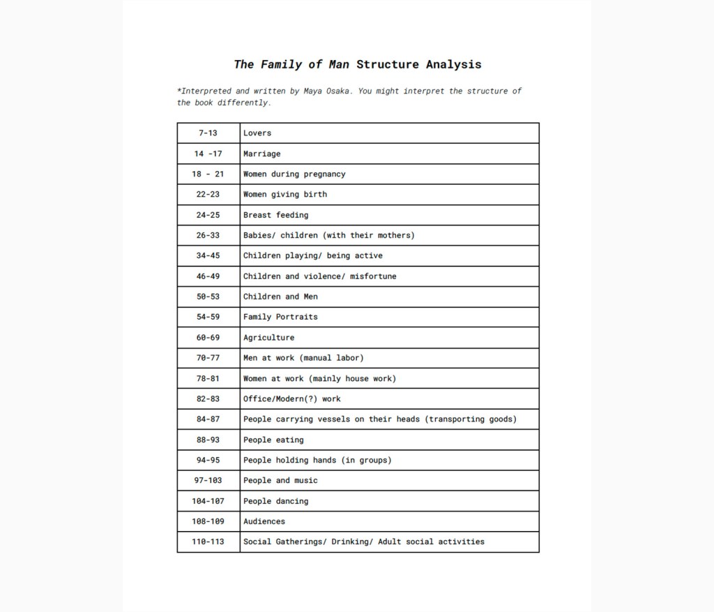
What I mean by ‘really looking at it’ is, instead of just flicking through the pages and briefly glancing at the photos I took the time to really take in each image, and to notice the narrative told through the photographs and how Steichen chose to curate the images to portray this narrative. From this experience I was able to see a clear order/narrative to the book which I listed in a spreadsheet. Each photo credits the photographer, where it was taken and which client or publication it was for (e.g. Life Magazine).
The introduction in the book explains that the exhibition was “conceived as a mirror of the universal elements and emotions in the everydayness of life—as a mirror of the essential oneness of mankind throughout the world.”
As I explored the book, I found myself wanting to answer the following questions:
- Where were the photographers from?
- Where were the photos taken?
- How many female photographers were involved?
- Who were the most featured photographers?
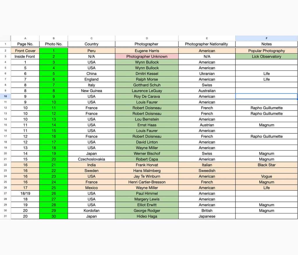
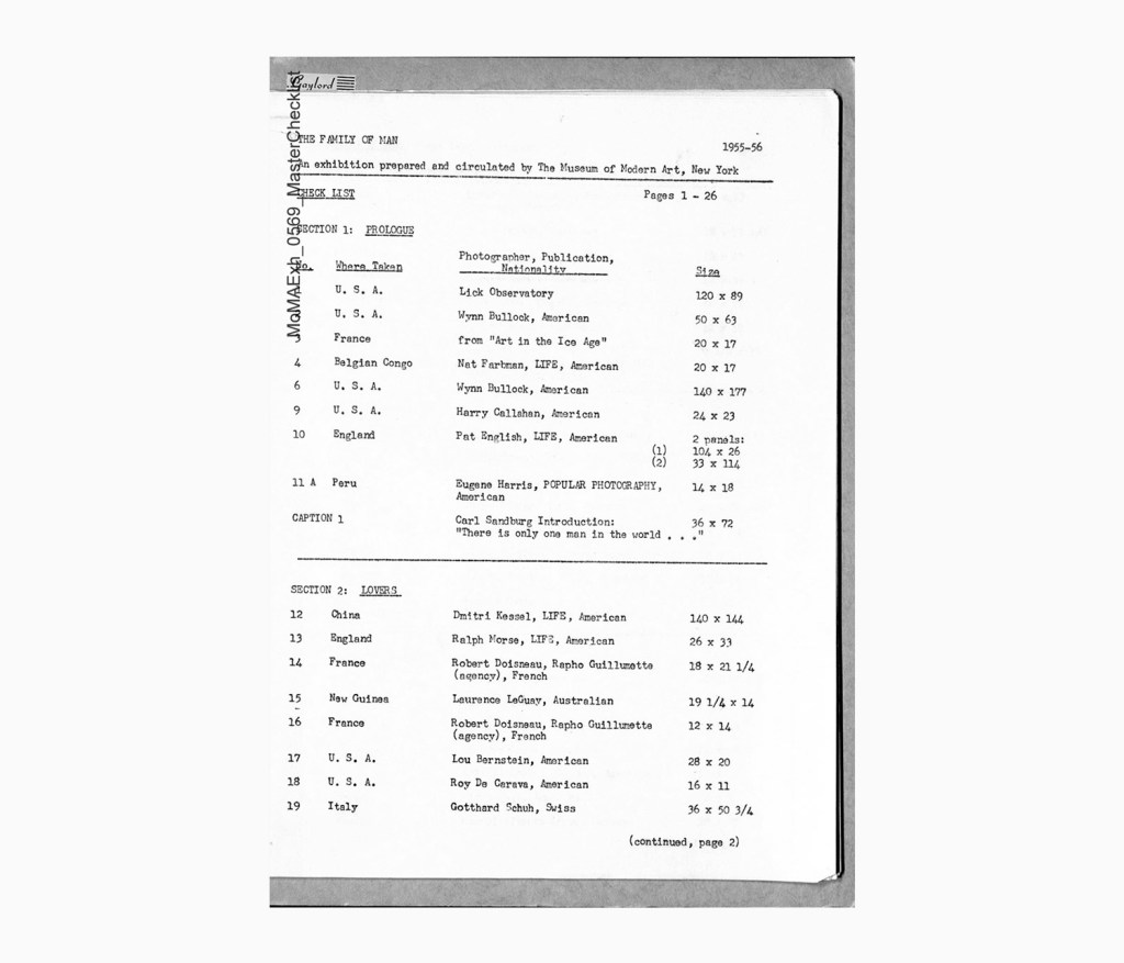
In order to answer these questions I created a master index of the photographs.
This shows where they appear in the book, the country depicted, the photographer and which organization the image is associated with or was made for. From this ‘master’ spreadsheet I compiled three more views:
- Photos by geography (country and continent)
- Photographer’s biographical data (consisting of their nationalities and gender)
- Most featured photographers.
Here is what I discovered:
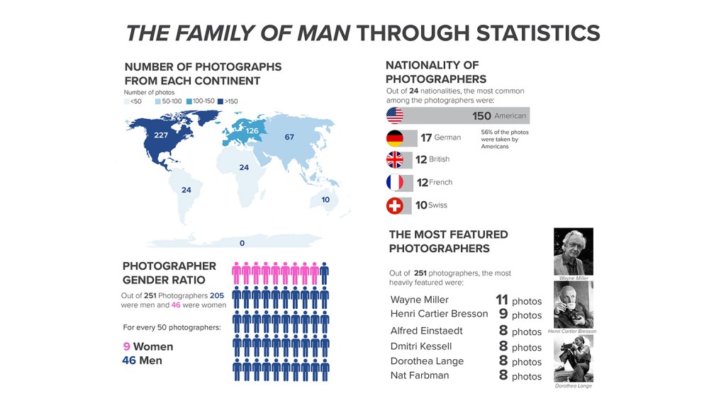
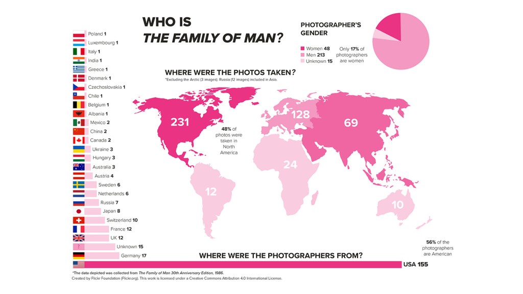
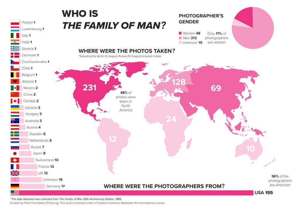
46% of the photos were taken in the USA (vs the rest of the world).
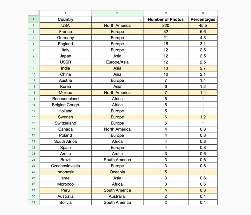
Out of 484 images depicted in The Family of Man 30th Anniversary Edition (1986), 220 are from the USA. That’s 46% of all the photos. The most heavily featured countries after America were: France (32 images), Germany (21 images) and England (15 images). All in Europe. Compared to America’s 46%, France, the runner up, makes up only 7% of the total number of images.
The image is a screenshot of a section of the photos by geography spreadsheet.
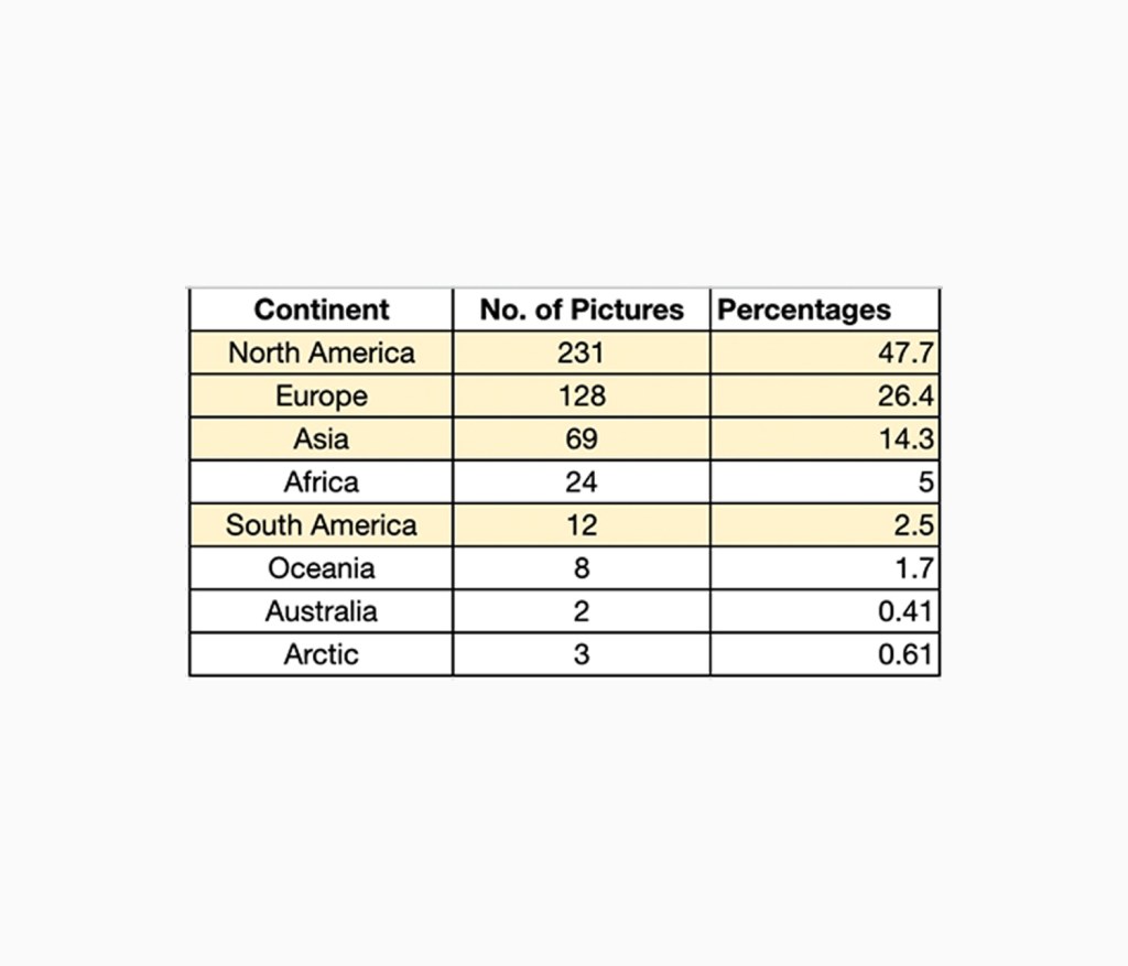
75% of the images were shot in North America or Europe.
- Northern America: 231 images (out of which 220 are from the USA)
- Europe: 128 images
- Asia: 69 images (including 12 images shot in Russia)
- Africa: 24
- South America: 12
- Oceania: 8
- Arctic: 3
- Australia: 2
At this stage I will note that as Russia spans across Asia and Europe, Russia’s 12 images have been included within Asia’s statistics (not Europe). Also the infographic excludes 3 images taken in the Arctic as they did not explicitly state which part of the Arctic they were taken in.
The image is a screenshot of a section of the photos by geography spreadsheet.
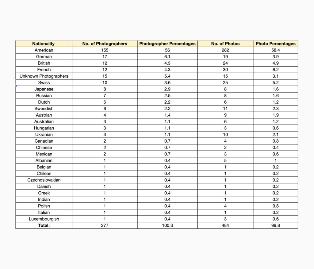
56% of the photographers were American.
Out of 251 known photographers, 155 were American. That is 56% of the total number of photographers. The most common nationalities that followed were: German (17), British and French (12 each), and 15 photographers were unknown. It is important to note that some of the photographers were multinationals and in these instances their birth nationality was counted. Information on the photographer’s nationalities were collected by searching up their name on the internet and looking for credible sources.
The image is a screenshot of a section of the photographer’s biographical data spreadsheet.
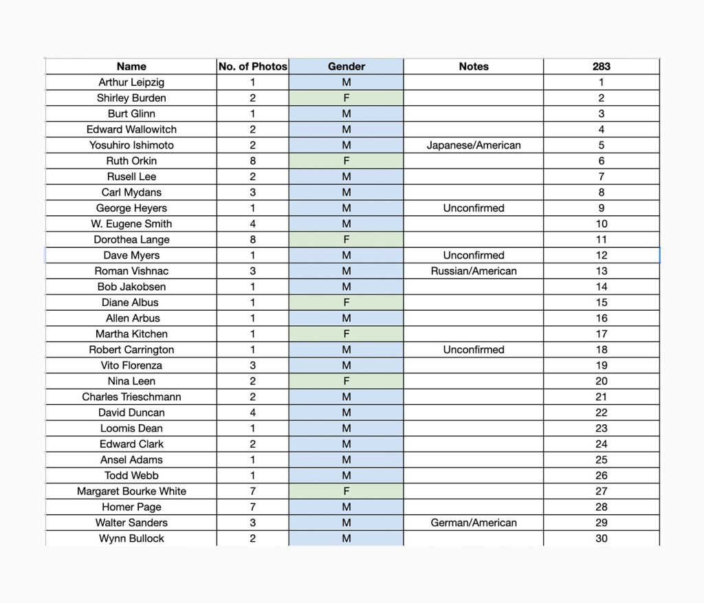
17% of the photographers were female.
Out of the 251 known photographers 48 were women. That is 17% of the total number of photographers.
Note: There was one photograph that was credited to Diane and Allan Arbus. I counted them as two separate individuals (one male, one female).
The image is a screenshot of the photographer’s biographical data spreadsheet.
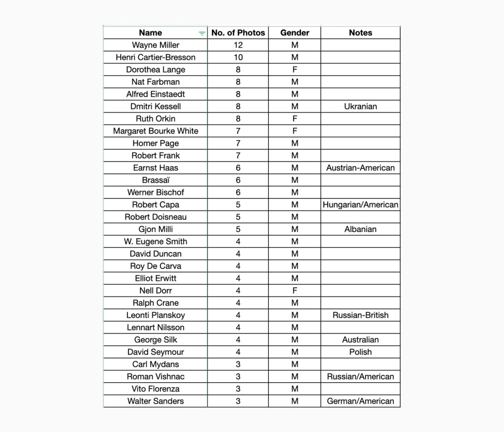
Which photographers were featured most?
- Wayne Miller (11 photos)
- Henri Cartier-Bresson (9 photos)
- Alfred Einstaedt (8 photos), Dmitri Kessell (8 photos), Dorothea Lange (8 photos), Nat Farbman (8 photos), Ruth Orkin (8 photos).
The image is a screenshot of the most featured photographers spreadsheet.
Conclusions
- The majority of photos were shot in the US and Europe.
- More than half of the photographers were American.
- Most of the photographers were men.
- Among the top 10 most featured photographers were three women (Dorothea Lange, Ruth Orkin and Margaret Bourke White).
Where are the lost photos?
On the back of The Family of Man (30th Anniversary Edition, 1986) it is stated that all 503 images from the original exhibition are showcased within the book. However, after checking through the book multiple times the number of images that I have counted (excluding the introduction images featuring images of the exhibition itself and a portrait of Steichen) are 484. This means there are 19 images that are missing.
This mystery is currently being solved by my fellow intern, Juwon Jung, who, as I write this, is cross referencing the original MoMa exhibition master checklist with the book. We will keep you posted on whether this mystery gets solved!
Creating the Infographics
While collecting this data, I began to think about how this data could be visualized. Datasets on a spreadsheet are boring to look at and can struggle to effectively communicate what they mean. So I decided to create an infographic to showcase the datasets.
Creating the infographics posed many creative challenges, especially because this was one of my first attempts at this sort of data visualization. One of the key challenges was to create visuals that are eye-catching but simple to read and communicate a clear message. In this case: that a disproportionately large amount of the photos and photographers are of or from the USA and the majority of photographers were men.
In order to draw attention to those facts, I used a combination of techniques: Firstly the statistics that I wanted to draw the most attention to are the brightest shade of pink. (The pink that was chosen is the same pink as the Flickr Foundation logo). Secondly, the pie chart and bar chart’s proportions are accurate and highlight just how disproportionate the statistics are. A comment next to each chart states a percentage that further highlights the point that is being made.
George Oates (Executive Director at Flickr.org)—who has extensive experience working in data visualisation—helped a lot with perfecting the look of the infographic. (Thanks George!)
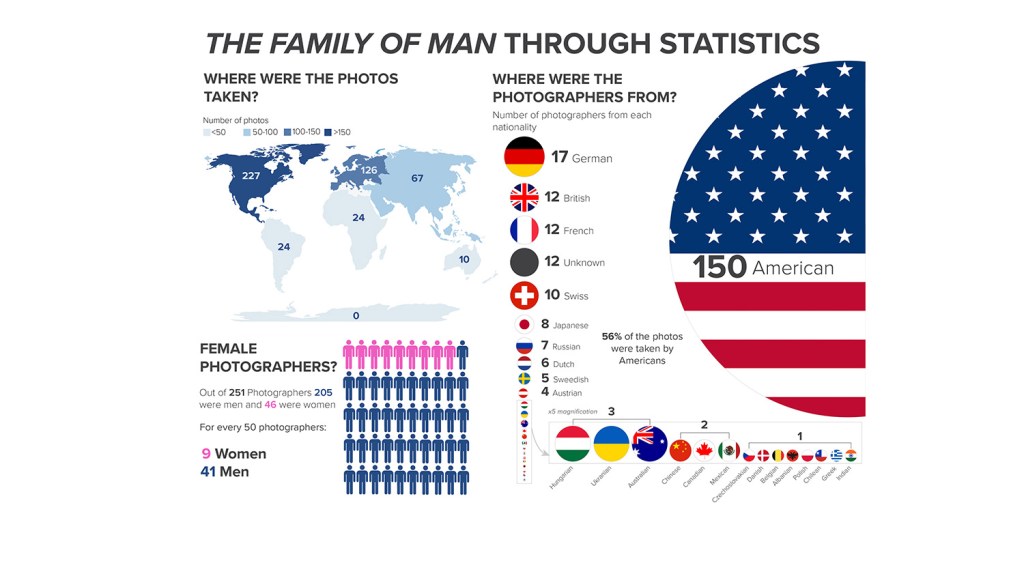
Below you can see how the graphics evolved.
*Note that the statistics on previous versions are not accurate!