When Past Meets Predictive: An interview with the curators of ‘A Generated Family of Man’

by Tori McKenna, Oxford Internet Institute

Design students, Juwon Jung and Maya Osaka, the inaugural cohort of Flickr Foundation’s New Curators program, embarked on a journey exploring what happens when you interface synthetic image production with historic archives.

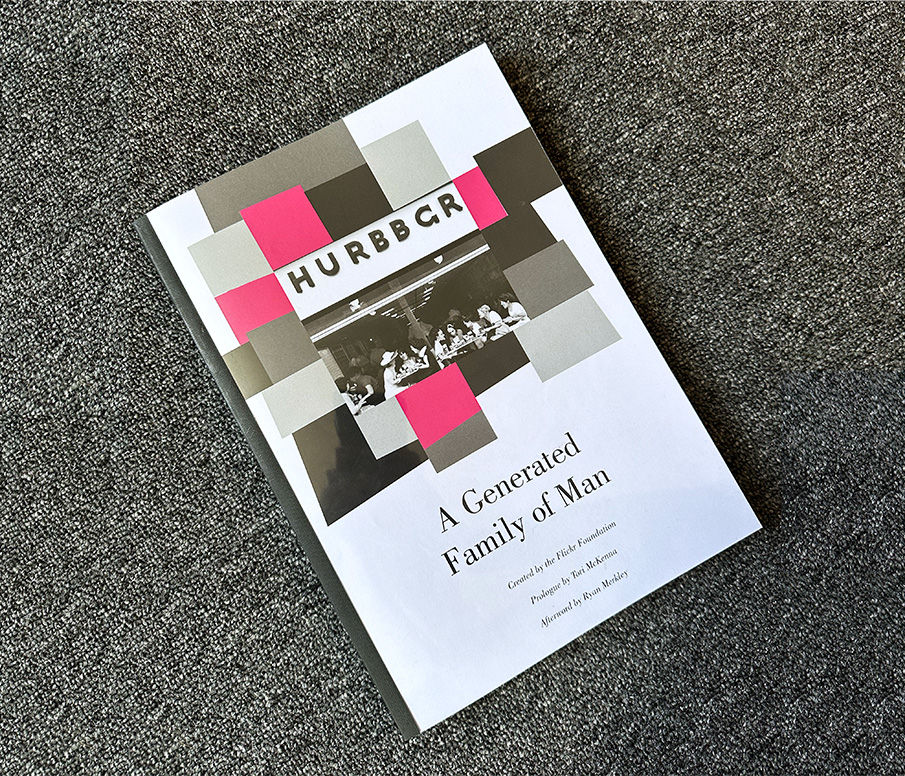
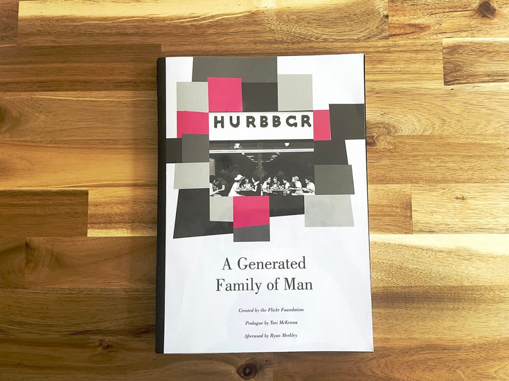
This blog post marks the release of Flickr Foundation’s A Generated Family of Man, the third iteration in a series of reinterpretations of the 1955 MoMA photography exhibition, The Family of Man.

Capturing the reflections, sentiments and future implications raised by Jung and Osaka, these working ‘field notes’ function as a snapshot in time of where we stand as users, creators and curators facing computed image generation. At a time when Artificial Intelligence and Large Language Models are still in their infancy, yet have been recently made widely accessible to internet users, this experiment is by no means an exhaustive analysis of the current state of play. However, by focusing on a single use-case, Edward Steichen’s The Family of Man, Jung and Osaka were able to reflect in greater detail and specificity over a smaller selection of images — and the resultant impact of image generation on this collection.

Observations from this experiment are phrased as a series of conversations, or ‘interfaces’ with the ‘machine’.

Interface 1: ‘That’s not what I meant’

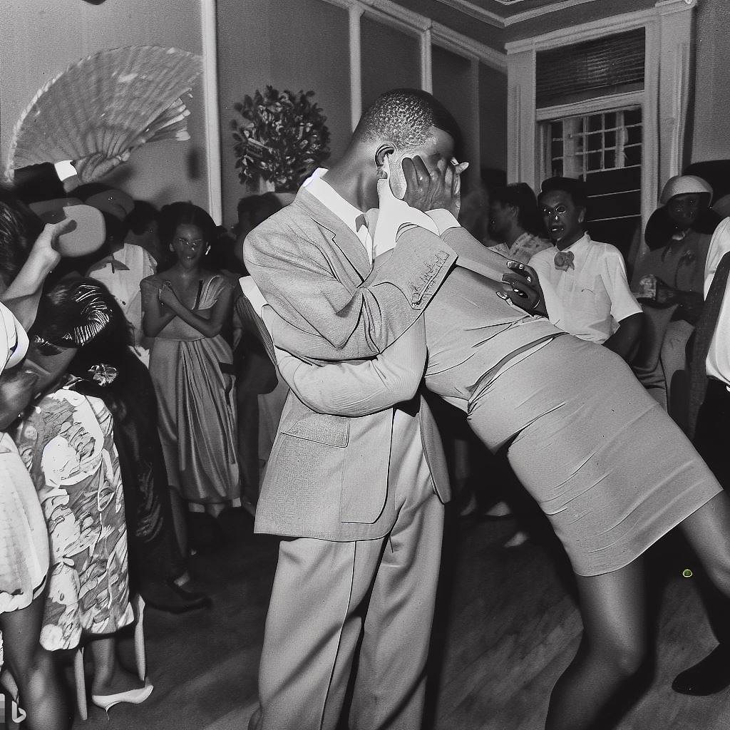
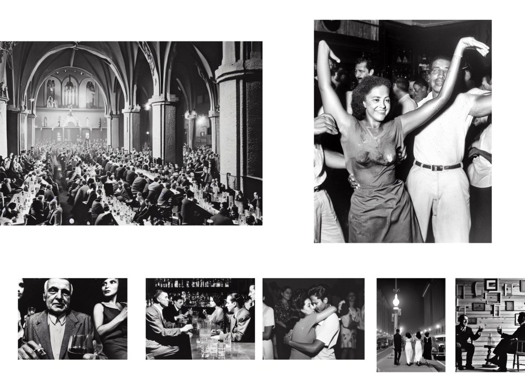
If the aim of image generation is verisimilitude, the first observation to remark upon when feeding captions into image generation tools is there are often significant discrepancies and deviations from the original photographs. AI produces images based on most-likely scenarios, and it became evident from certain visual elements that the generator was ‘filling in’ what the machine ‘expects’. For example, when replicating the photograph of an Austrian family eating a meal, the image generator resorted to stock food and dress types. In order to gain greater accuracy, as Jung explained, “we needed to find key terms that might ‘trick’ the algorithm”. These included supplementing with descriptive prompts of details (e.g. ‘eating from a communal bowl in the centre of the table’), as well as more subjective categories gleaned from the curators interpretations of the images (’working-class’, ‘attractive’, ‘melancholic’). As Osaka remarked, “the human voice in this process is absolutely necessary”. This constitutes a talking with the algorithm, a back-and-forth dialogue to produce true-to-life images, thus further centering the role of the prompt generator or curator.

This experiment was not about producing new fantasies, but to test how well the generator could reproduce historical context or reinterpret archival imagery. Adding time-period prompts, such as “1940s-style”, result in approximations based on the narrow window of historical content within the image generator’s training set. “When they don’t have enough data from certain periods AI’s depiction can be skewed”, explains Jung. This risks reflecting or reinforcing biased or incomplete representations of the period at hand. When we consider that more images were produced in the last 20 years than the last 200 years, image generators have a far greater quarry to ‘mine’ from the contemporary period and, as we saw, often struggle with historical detail.

Key take-away:
Generated images of the past are only as good as their training bank of images, which themselves are very far from representative of historical accuracy. Therefore, we ought to develop a set of best practices for projects that seek communion between historic images or archives and generated content.

Interface 2: ‘I’m not trying to sell you anything’

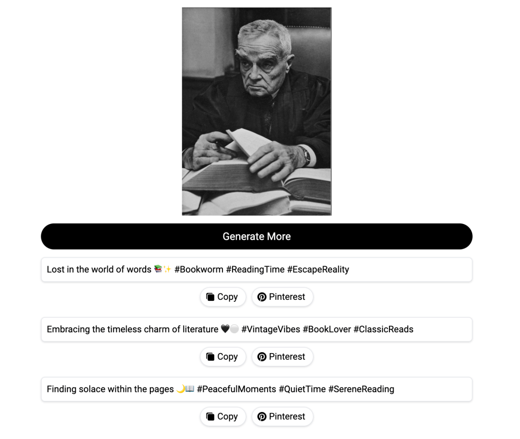
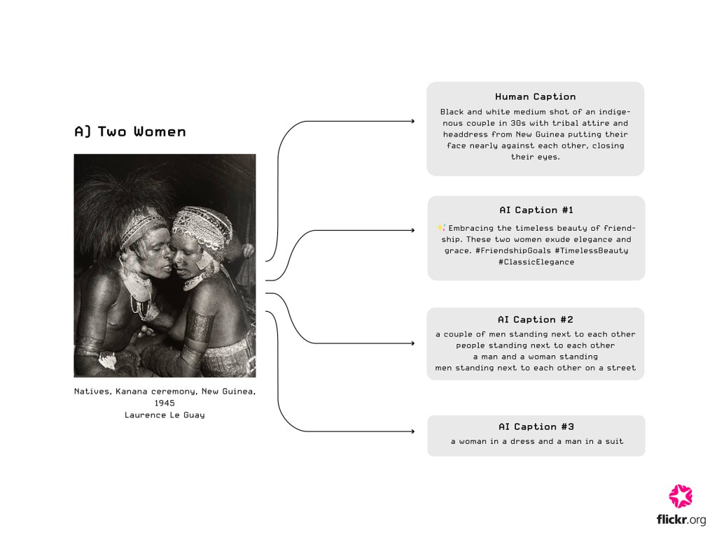
In addition to synthetic image generation, Jung & Osaka also experimented with synthetic caption generation: deriving text from the original images of The Family of Man. The generated captions were far from objective or purely descriptive. As Osaka noted, “it became clear the majority of these tools were developed for content marketing and commercial usage”, with Jung adding, “there was a cheesy, Instagram-esque feel to the captions with the overuse of hashtags and emojis”. Not only was this outdated style instantly transparent and ‘eyeroll-inducing’ for savvy internet users, but in some unfortunate cases, the generator wholly misrepresented the context. In Al Chang’s photo of a grief-stricken America soldier being comforted by his fellow troops in Korea, the image generator produced the following tone-deaf caption:

“Enjoying a peaceful afternoon with my best buddy 🐶💙 #dogsofinstagram #mananddog #bestfriendsforever” (there was no dog in the photograph).

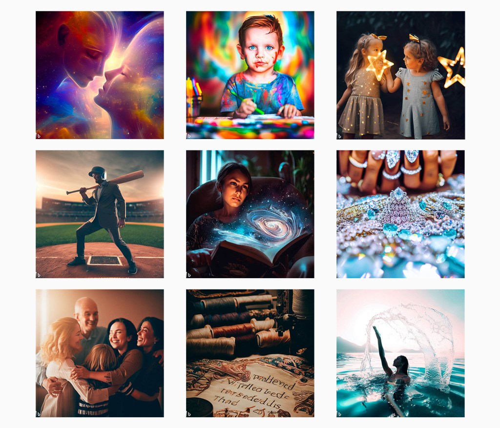
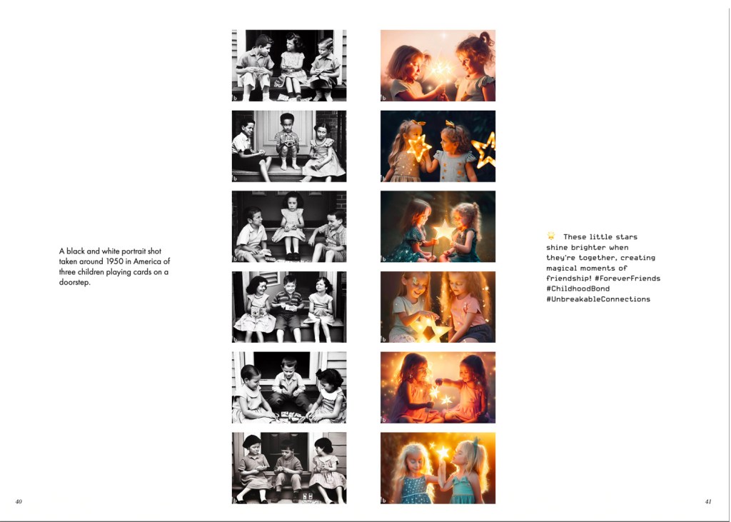
When these “Instagram-esque” captions were fed back into image generation, naturally they produced overly positive, dreamy, aspirational images that lacked the ‘bite’ of the original photographs – thus creating a feedback loop of misrecognition and misunderstood sentiment.

The image and caption generators that Jung & Osaka selected were free services, in order to test what the ‘average user’ would most likely first encounter in synthetic production. This led to another consideration around the commercialism of such tools, as the internet adage goes, “if its free, you’re the product”. Using free AI services often means relinquishing input data, a fact that might be hidden in the fine print. “One of the dilemmas we were internally facing was ‘what is actually happening to these images when we upload them’?” as Jung pondered, “are we actually handing these over to the generators’ future data-sets?”. “It felt a little disrespectful to the creator”, according to Osaka, “in some cases we used specific prompts that emulate the style of particular photographs. It’s a grey area, but perhaps this could even be an infringement on their intellectual property”.

Key take-away:
The majority of synthetic production tools are built with commercial uses in mind. If we presume there are very few ‘neutral’ services available, we must be conscious of data ownership and creator protection.

Interface 3: ‘I’m not really sure how I feel about this’

The experiment resulted in hundreds of synthetic guesses, which induced surprising feelings of guilt among the curators. “In a sense, I felt almost guilty about producing so many images”, reports Jung, with e-waste and resource intensive processing power front of mind. “But we can also think about this another way” Osaka continues, “the originals, being in their analogue form, were captured with such care and consideration. Even their selection for the exhibition was a painstaking, well-documented process”.

We might interpret this as simply a nostalgic longing for finiteness of bygone era, and our disillusionment at today’s easy, instant access. But perhaps there is something unique to synthetic generation here: the more steps the generator takes from the original image, the more degraded the original essence, or meaning, becomes. In this process, not only does the image get further from ‘truth’ in a representational sense, but also in terms of original intention of the creator. If the underlying sense of warmth and cooperation in the original photographs disappears along the generated chain, is there a role for image generation in this context at all? “It often feels like something is missing”, concludes Jung, “at its best, synthetic image generation might be able to replicate moments from the past, but is this all that a photograph is and can be?”

Key take-away: Intention and sentiment are incredibly hard to reproduce synthetically. Human empathy must first be deployed to decipher the ‘purpose’ or background of the image. Naturally, human subjectivity will be input.

Our findings

Our journey into synthetic image generation underscores the indispensable role of human intervention. While the machine can be guided towards accuracy by the so-called ‘prompt generator’, human input is still required to flesh out context where the machine may be lacking in historic data.

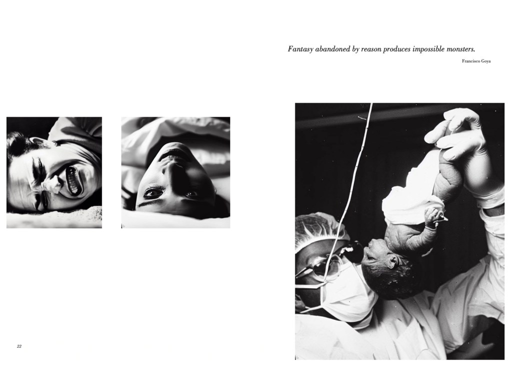
At its present capacity, while image generation can approximate visual fidelity, it falters when it attempts to appropriate sentiment and meaning. The uncanny distortions we see in so many of the images of A Generated Family of Man. Monstrous fingers, blurred faces, melting body parts are now so common to artificially generated images they’ve become almost a genre in themselves. These appendages and synthetic ad-libs contravene our possible human identification with the image. This lack of empathic connection, the inability to bridge across the divide, is perhaps what feels so disquieting when we view synthetic images.

As we have seen, when feeding these images into caption generators to ‘read’ the picture, only humans can reliably extract meaning from these images. Trapped within this image-to-text-to-image feedback loop, as creators or viewers we’re ultimately left calling out to the machine: Once More, with Feeling!

We hope projects like this spark the flourishing of similar experiments for users of image generators to the critical and curious about the current state of artificial “intelligence”.

Find out more about A Generated Family of Man in our New Curators program area.

Making A Generated Family of Man: Revelations about Image Generators

Juwon Jung | Posted 29 September 2023

I’m Juwon, here at the Flickr Foundation for the summer this year. I’m doing a BA in Design at Goldsmiths. There’s more background on this work in the first blog post on this project that talks about the experimental stages of using AI image and caption generators.
“What would happen if we used AI image generators to recreate The Family of Man?”

When George first posed this question in our office back in June, we couldn’t really predict what we would encounter. Now that we’ve wrapped up this uncanny yet fascinating summer project, it’s time to make sense out of what we’ve discovered, learned, and struggled with as we tried to recreate this classic exhibition catalogue.

Bing Image Creator generates better imitations when humans write the directions

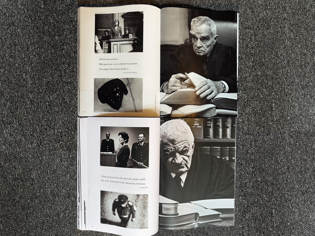
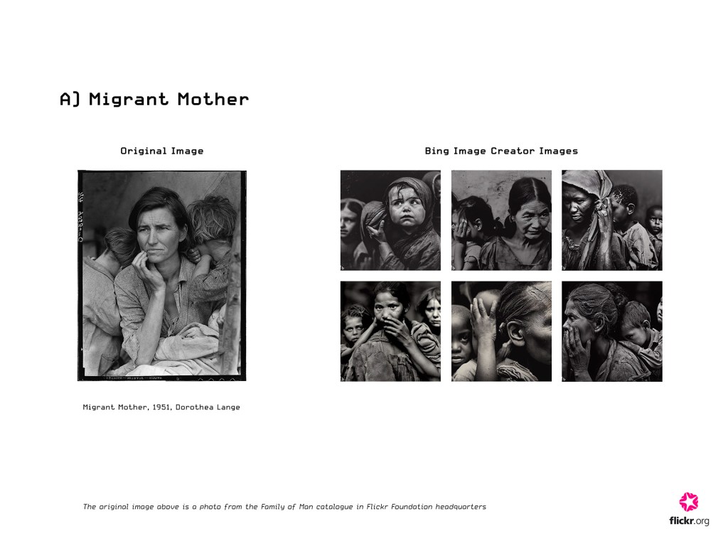
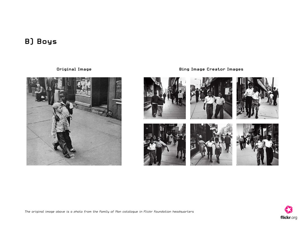
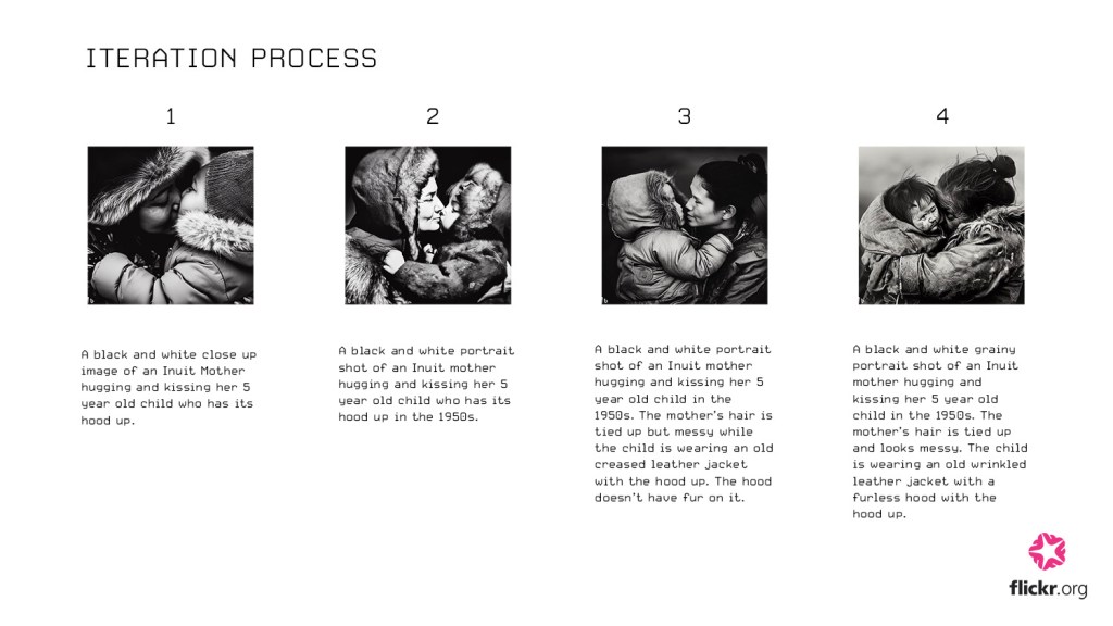
We used the Bing Image Creator throughout the project and now feel quite familiar with its strengths and weaknesses. There were a few instances where the Bing Image Creator would produce surprisingly similar photographs to the originals when we wrote captions, as can be seen below:

Here are the caption iterations we made for the image of the judge (shown above, on the right page of the book):

1st iteration:
A grainy black and white portrait shot taken in the 1950s of an old judge. He has light grey hair and bushy eyebrows and is wearing black judges robes and is looking diagonally past the camera with a glum expression. He is sat at a desk with several thick books that are open. He is holding a page open with one hand. In his other hand is a pen. 

2nd iteration:
A grainy black and white portrait shot taken in the 1950s of an old judge. His body is facing towards the camera and he has light grey hair that is short and he is clean shaven. He is wearing black judges robes and is looking diagonally past the camera with a glum expression. He is sat at a desk with several thick books that are open. 

3rd iteration:
A grainy black and white close up portrait taken in the 1950s of an old judge. His body is facing towards the camera and he has light grey hair that is short and he is clean shaven. He is wearing black judges robes and is looking diagonally past the camera with a glum expression. He is sat at a desk with several thick books that are open. 

Bing Image Creator is able to demonstrate such surprising capabilities only when the human user accurately directs it with sharp prompts. Since Bing Image Creator uses natural language processing to generate images, the ‘prompt’ is an essential component to image generation. 

Human description vs AI-generated interpretation

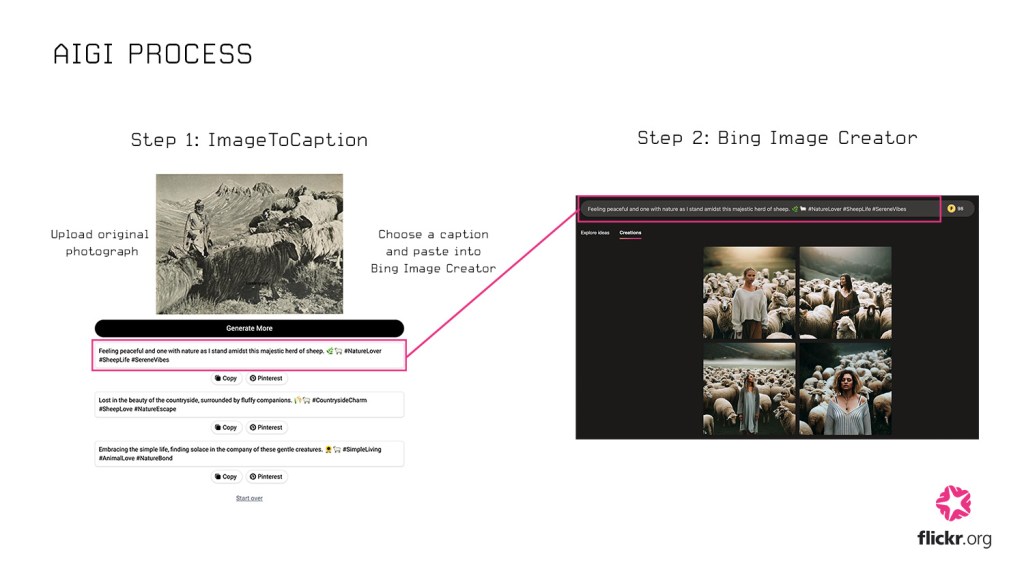
We can compare human-written captions to the AI-generated captions made by another tool we used, Image-to-Caption. Since the primary purpose of Image-to-Caption.io is to generate ‘engaging’ captions for social media content, the AI-generated captions generated from this platform contained cheesy descriptors, hashtags, and emojis.

Using screenshots from the original catalogue, we fed images into that tool and watched as captions came out. This non-sensical response emerged for the same picture of the judge:

“In the enchanted realm of the forest, where imagination takes flight and even a humble stick becomes a magical wand. ✨🌳 #EnchantedForest #MagicalMoments #ImaginationUnleashed”

As a result, all of the images generated from AI captions looked like they were from the early Instagram-era in 2010; highly polished with strong, vibrant color filters. 

Here’s a selection of images generated using AI prompts from Image-to-Caption.io

Ethical implications of generated images?

As we compared all of these generated  images, it was our natural instinct to instantly wonder about the actual logic or dataset that the generative algorithm was operating upon. There were also certain instances where the Bing Image Creator would not be able to generate the correct ethnicity of the subject matter in the photograph, despite the prompt clearly specifying the ethnicity (over the span of 4-5 iterations).

Here are some examples of ethnicity not being represented as directed: 

What’s under the hood of these technologies?

What does this really mean though? I wanted to know more about the relationship between these observations and the underlying technology of the image generators, so I looked into the DALL-E 2 model (which is used in Bing Image Creator). 

DALL-E 2 and most other image generation tools today use the diffusion model to generate a new image that conveys the same, if not the most similar, semantic information of the input caption. In order to correctly match the visual semantic information to the corresponding textual semantic information, (e.g. matching the image of an apple to the word apple) these generative models are trained with large subsets of images and image descriptions online. 

Open AI has admitted that the “technology is constantly evolving, and DALL-E 2 has limitations” in their informational video about DALL-E 2.  

Such limitations include:

  • If the data used to train the model has been flawed and contains images that are incorrectly labeled, it may produce an image that doesn’t correspond to the text prompt. (e.g. if there are more images of a plane matched with the word car, the model can produce an image of a plane from the prompt ‘car’) 
  • The model may exhibit representational bias if it hasn’t been trained enough on a certain subject (e.g. producing an image of any kind of monkey rather than the species from the prompt ‘howler monkey’) 

From this brief research, I realized that these subtle errors of Bing Image Creator shouldn’t be simply overlooked. Whether or not Image Creator is producing relatively more errors for certain prompts could signify that, in some instances, the generated images may reflect the current visual biases, stereotypes, or assumptions that exist in our world today. 

A revealing experiment for our back cover

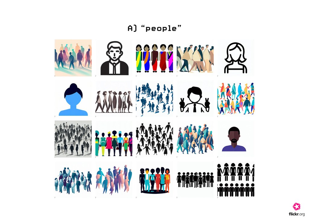
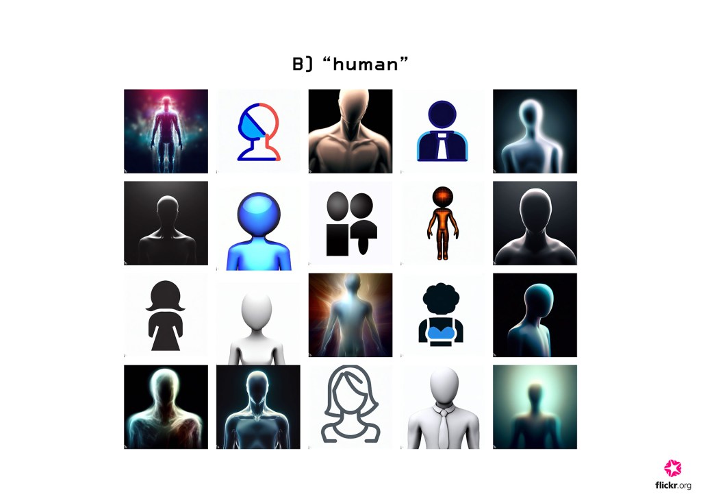
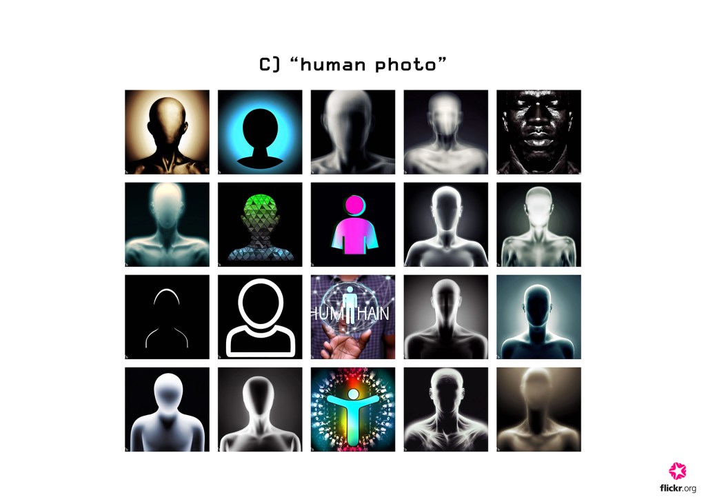
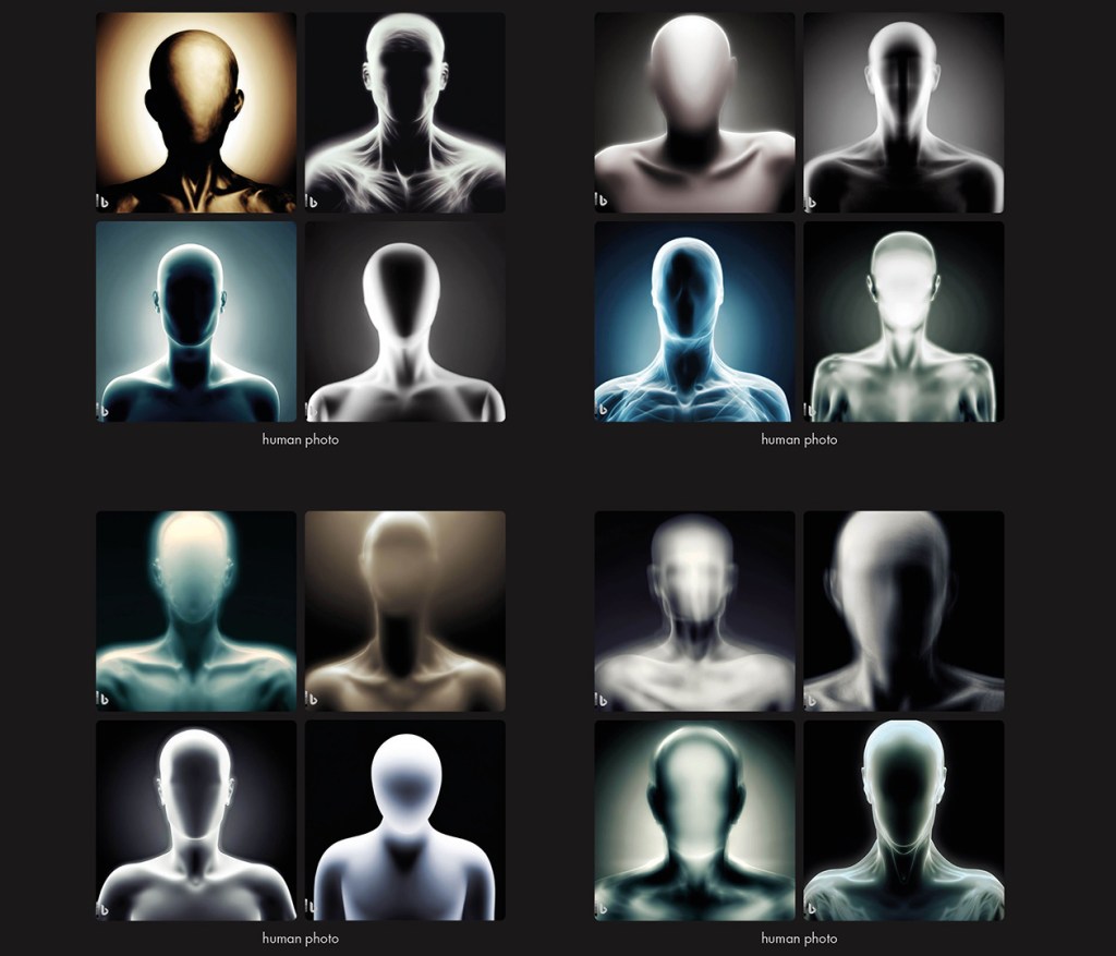
After having worked with very specific captions for hoped-for outcomes, we decided to zoom way out to create a back cover for our book. Instead of anything specific, we spent a short period after lunch one day experimenting with very general captioning to see the raw outputs. Since the theme of The Family of Man is the oneness of mankind and humanity, we tried entering the short words, “human,” “people,” and “human photo” in the Bing Image Creator.

These are the very general images returned to us: 

What do these shadowy, basic results really mean?
Is this what we, humans, reduce down to in the AI’s perspective? 

Staring at these images on my laptop in the Flickr Foundation headquarters, we were all stunned by the reflections of us created by the machine. Mainly consisting of elementary, undefined figures, the generated images representing the word “humans” ironically conveyed something that felt inherently opposite. 

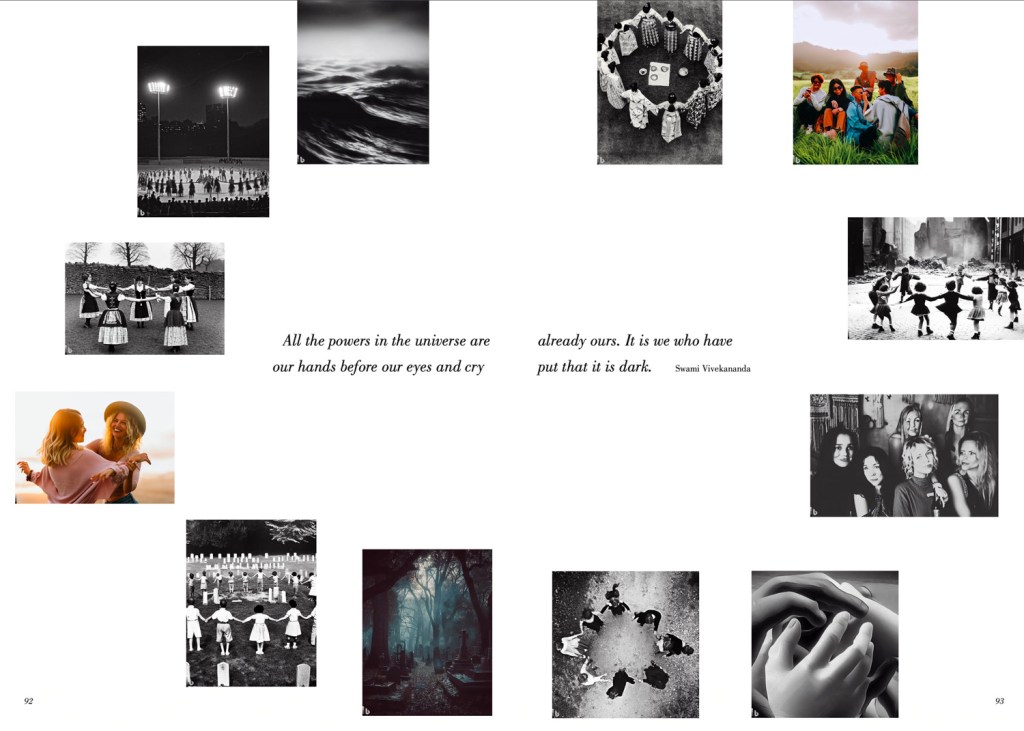
This quick experiment at the end of the project revealed to us that perhaps having simple, general words as prompts instead of thorough descriptions may most transparently reveal how these AI systems fundamentally see and understand our world.

A Generated Family of Man is just the tip of the iceberg.

These findings aren’t concrete, but suggest possible hypotheses and areas of image generation technology that we can conduct further research on. We would like to invite everyone to join the Flickr Foundation on this exciting journey, to branch out from A Generated Family of Man and truly pick the brains of these newly introduced machines. 

Here are the summarizing points of our findings from A Generated Family of Man:
  • The abilities of Bing Image Creator to generate images with the primary aim of verisimilitude is impressive when the prompt (image caption) is either written by humans or accurately denotes the semantic information of the image.
  • In certain instances, the Image Creator performed relatively more errors when determining the ethnicity of the subject matter. This may indicate the underlying visual biases or stereotypes of the datasets the Image Creator was trained with.
  • When entering short, simple words related to humans into the Image Creator, it responded with undefined, cartoon-like human figures. Using such short prompts may reveal how the AI fundamentally sees our world and us. 

Open questions to consider

Using these findings, I thought that changing certain parameters of the investigation could make interesting starting points of new investigations, if we spent more time at the Flickr Foundation, or if anyone else wanted to continue the research. Here are some different parameters that can be explored:

  • Frequency of iteration: increase the number of trials of prompt modification or general iterations to create larger data sets for better analysis.
  • Different subject matter: investigate specific photography subjects that will allow an acute analysis on narrower fields (e.g. specific types of landscapes, species, ethnic groups).
  • Image generator platforms: look into other image generator softwares to observe distinct qualities for differing platforms.

How exciting would it be if different groups of people from all around the world participated in a collective activity to evaluate the current status of synthetic photography, and really analyze the fine details of these models? Maybe that wouldn’t scientifically reverse-engineer these models but even from qualitative investigations, findings emerge. What more will we be able to find? Will there be a way to match, cross-compare the qualitative and even quantitative investigations to deduce a solid (perhaps not definite) conclusion? And if these investigations were to take place in intervals of time, which variables will change? 

To gain inspiration for these questions, take a look at the full collection of images of A Generated Family of Man on Flickr!

Creating A Generated Family of Man

Author: Maya Osaka

Find out about the process that went into creating A Generated Family of Man, the third volume of A Flickr of Humanity.

A Flickr of Humanity is the first project in the New Curators program, revisiting and reinterpreting The Family of Man, an exhibition held at MoMa in 1955. The exhibition showcased 503 photographs from 68 countries, celebrating universal aspects of the human experience. It was a declaration of solidarity following the Second World War. 

For our third volume of A Flickr of Humanity we decided to explore the new world of generative AI using Microsoft Bing’s Image Creator to regenerate The Family of Man catalog (30th Anniversary Edition). The aim of the project was to investigate synthetic image generation to create a ‘companion publication’ to the original, and that will act as a timestamp, to showcase the state of generative AI in 2023.

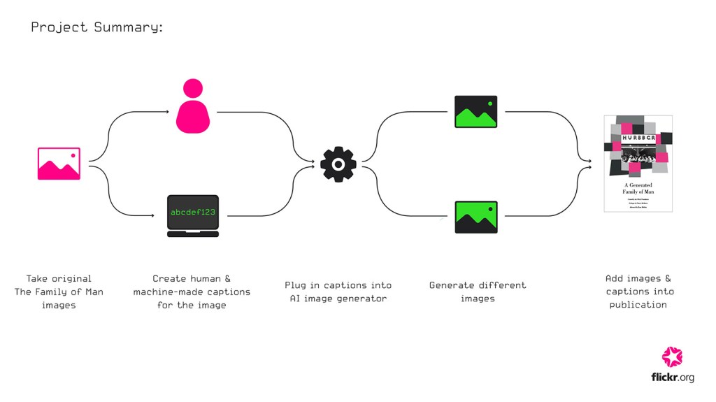
Project Summary

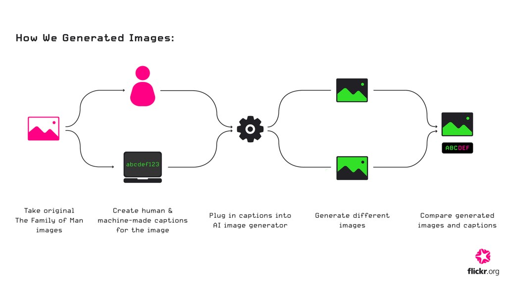
  1. We created new machine-generated versions of photographs from The Family of Man by writing a caption for each image and passing it through Microsoft Bing’s Image Creator. These images will be referred to as Human Mediated Images (HMI.)
  2. We fed screenshots of the original photographs into ImageToCaption, an AI-powered caption generator which produces cheesy Instagramesque captions, including emojis and hashtags. These computed captions were then passed into Bing’s Image Creator to generate an image only mediated by computers. These images will be referred to as AI-generated Images (AIGI).

We curated a selection of these generated images and captions into the new publication, A Generated Family of Man.

Image generation process

It is important to note that we decided to use free AI generators because we wanted to explore the most accessible generative AI.

Generating images was time-consuming. In our early experiments, we generated several iterations of each photograph to try and get it as close to the original as possible. We’d vary the caption in each iteration to work towards a better attempt. We decided it would be more interesting to limit our caption refinements so we could see and show a less refined output. We decided to set a limit of two caption-writing iterations for the HMIs.

For the AIGIs we chose one caption from the three from the first set of generated responses. We’d use the selected caption to do one iteration of image generation, unless the caption was blocked, in which case we would pick another generated caption and try that. 

Once we had a good sense of how much labour was required to generate these images, we set an initial target to generate half of the images in the original publication. The initial image generation process, in which we spawned roughly 250 of the original photographs took around 4 weeks. We then had roughly 500 generated images with (about half HMIs and half AIGIs), and we could begin the layout work.

Making the publication

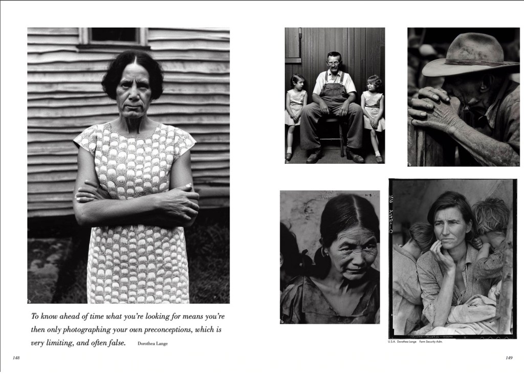
The majority of the photographs featured in The Family of Man are still in copyright so we were unable to feature the original photographs in our publication. That’s apart from the two Dorothea Lange photographs we decided to feature, and which have no known copyright. 

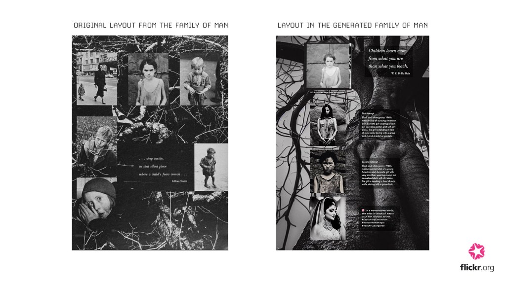
We decided to design the publication to act as a ‘companion publication’ to the original catalog. As we progressed making the layout, we imagined the ideal situation: the reader would have an original The Family of Man catalogue to hand to compare and contrast the original photographs and generated images side by side. With this in mind we designed the layout of the publication as an echo of the original, to streamline this kind of comparison.

It was important to demonstrate the distinctions between HMI and AIGI versions of the original images, so in some cases we shifted the layout to allow this.

Identifying HMIs and AIGIs

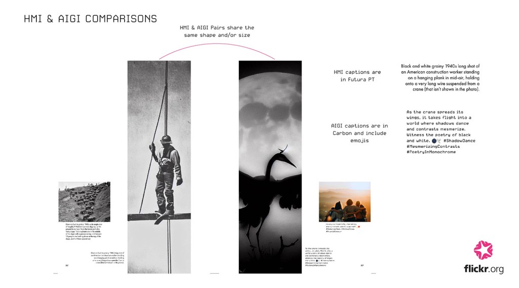
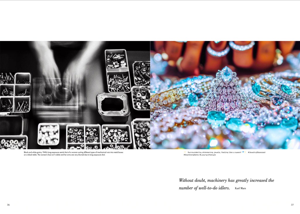
There was a lot of discussion around whether a reader would identify an image as an HMI or AIGI. All of the HMI images are black and white—because “black and white” and “grainy” were key human inputs in our captions to get the style right—while most of the AIGI images came out in colour. That in itself is an easy way to identify most of the images. We made the choice to use different typefaces on the captions too.

It is fascinating to compare the HMI and AIGI imagery, and we wanted to share that in the publication. So, in some cases, we’ve included both image types so readers can compare. Most of the image pairs can be identified because they share the same shape and size. All HMIs also sit on the left hand side of their paired AIGI. 

In both cases we decided that a subtle approach might be more entertaining as it would leave it in the readers hands to interpret or guess which images are which.

To watermark, or not to watermark?

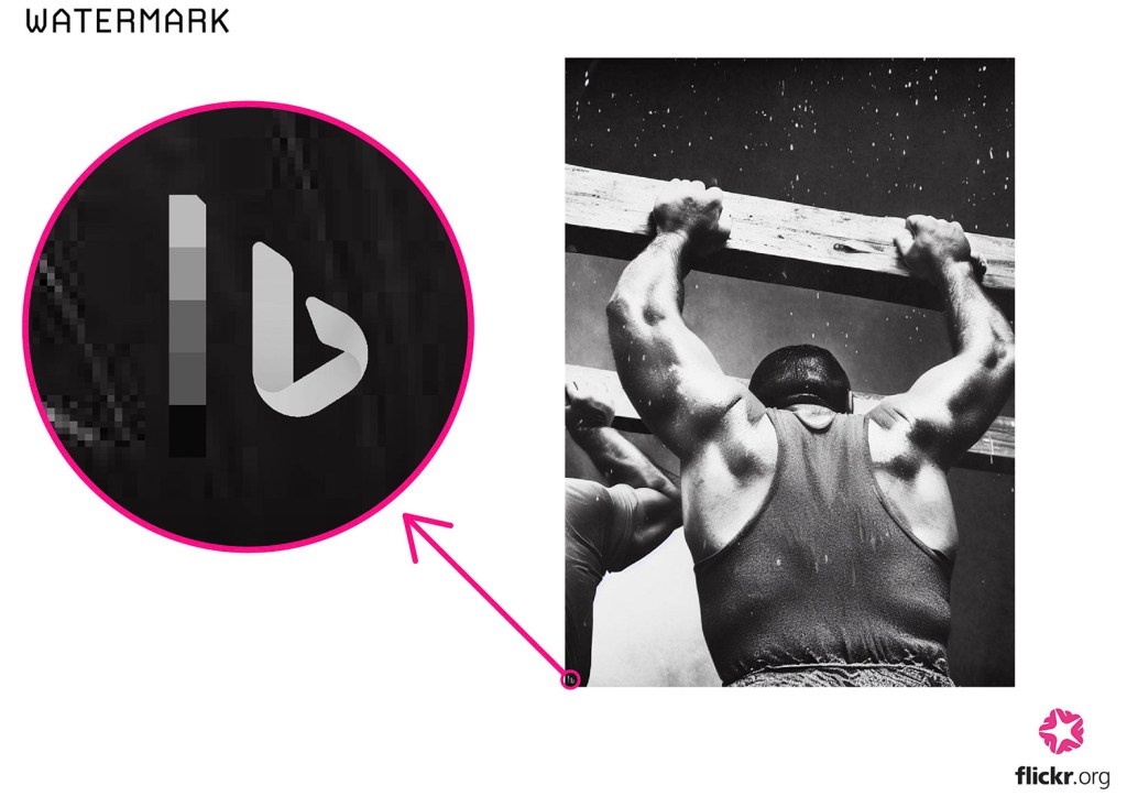
Another issue that came up was around how to make it clear which images are AI-generated as there are a few images that are actual photographs. All AI images generated by Bing’s Image Creator come out with a watermark in the bottom left corner. As we made the layout, some of the original watermarks were cropped or moved out of the frame, so we decided to add the watermarks back into the AI-generated images in the bottom left corner so there is a way to identify which images are AI-generated.

Captions and quotes

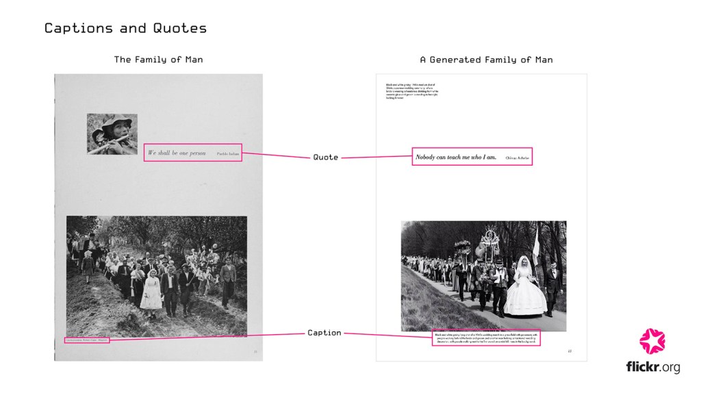
In the original The Family of Man catalog, each image has a caption to show the photographer’s name, the country the photograph was taken in, and any organizations  the photograph is associated with. There are also quotes that are featured throughout the book. 

For A Generated Family of Man we decided to use the same typefaces and font sizes as the original publication. 

We decided to display the captions that were used to generate the images because we wanted to illustrate our inputs, and also those that were computer-generated. Our captions are much longer than the originals, so to prevent the pages from looking too cluttered, we added captions to a small selection of images. We decided to swap out the original quotes for quotes that are more relevant to the 21st century.

Below you can see some example pages from A Generated Family of Man.

Reflection

I had never really thought about AI that much before working on this project. I’ve spent weeks generating hundreds of images and I’ve gotten familiar with communicating with Bing’s Image Creator. I’ve been impressed by what it can do while being amused and often horrified by the weird humans it generates. It feels strange to be able to produce an image in a matter of seconds that is of such high quality, especially when we look at images that are not photo-realistic but done in an illustrative style. In ‘On AI-Generated Works, Artists, and Intellectual Property ‘, Ryan Merkley says ‘There is little doubt that these new tools will reshape economies, but who will benefit and who will be left out?’. As a designer it makes me feel a little worried about my future career as it feels almost inevitable, especially in a commercial setting, that AI will leave many visual designers redundant. 

Generative AI is still in its infancy (Bing’s Image Creator was only announced and launched in late 2022!) and soon enough it will be capable of producing life-like images that are indistinguishable from the real thing. If it isn’t already. For this project we used Bing’s Image Creator, but it would be interesting to see how this project would turn out if we used another image generator such as MidJourney, which many consider to be at the top of its game. 

There are bound to be many pros and cons to being able to generate flawless images and I am simultaneously excited and terrified to see what the future holds within the field of generative AI and AI technology at large.

Kickstarting A Generated Family of Man: Experimenting with Synthetic Photography 

Juwon Jung | Posted 18 July 2023

Ever since we created our Version 2 of A Flickr of Humanity, we’ve been brainstorming different ways to develop this project at the Flickr Foundation headquarters. Suddenly, we came across the question: what would happen if we used AI image generators to recreate The Family of Man

  • What could this reveal about the current generative AI models and their understanding of photography?
  • How might it create a new interpretation of The Family of Man exhibition?
  • What issues or problems would we encounter with this uncanny approach?


We didn’t know the answers to these questions, or what we might even find, so we decided to jump on board for a new journey to Version 3. (Why not?!)

We split our research into three main stages:

  1. Research into different AI image generators
  2. Exploring machine-generated image captions
  3. Challenges of using source photography responsibly in AI projects

And, we decided to try and see if we could use the current captioning and image generation technologies to fully regenerate The Family of Man for our Version 3.


Stage 1. Researching into different AI image generator softwares

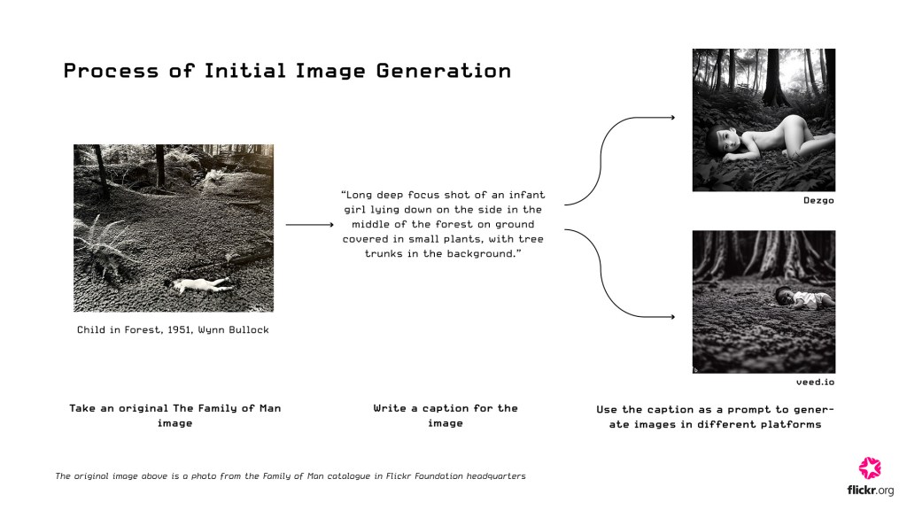
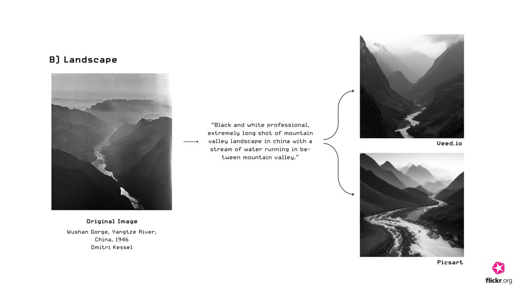
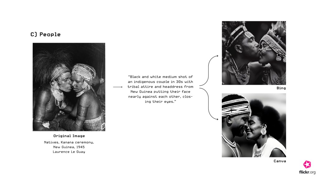
Since the rapid advancements of generative artificial intelligence in the last couple of years, hundreds of image-generating applications, such as DALL-E 2 or Midjourney, have been launched. In the initial research stage, we tested different platforms by creating short captions of roughly ten images from The Family of Man and observing the resulting outputs.

Stage 1 Learnings: 

  • Image generators are better at creating photorealistic images of landscapes, objects, and animals than close-up shots of people. 
  • Most image generators, especially those that are free, have caps on the numbers of images that can be produced in a day, slowing down production speed. 
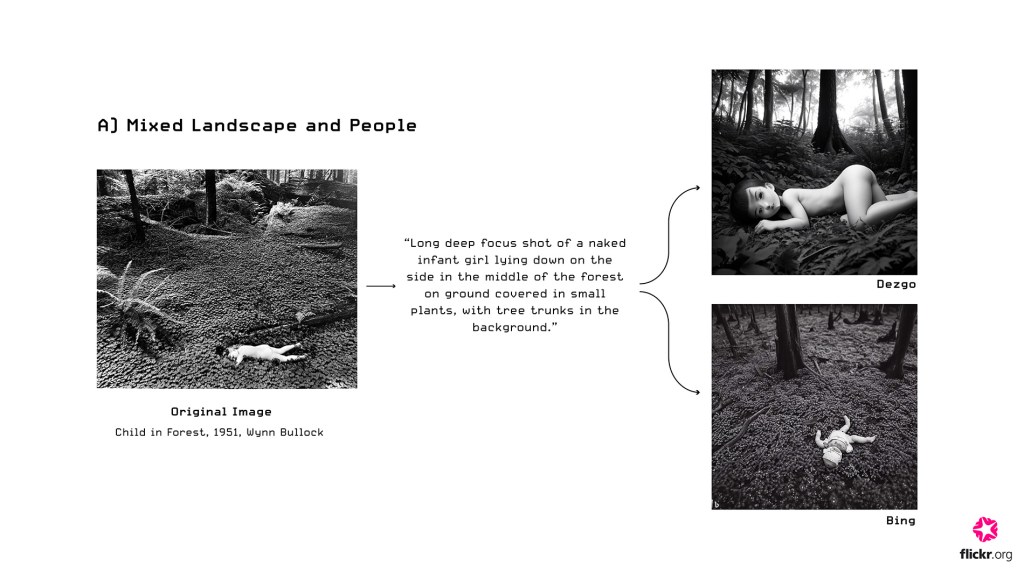
  • Some captions had to be altered because they violated terms and policies of the platforms; certain algorithms would censor prompts with potential to create unethical, explicit images (e.g. Section A photo caption – the word “naked” could not be used for Microsoft Bing)

We decided to use Microsoft Bing’s Image generator for this project because it produced images with highest quality (across all image categories) with most flexible limits on the quantity of images that could be generated. We’ve tested other tools including Dezgo, Veed.io, Canva, and Picsart


Stage 2. Exploring image captions: AI Caption Generators

Image generators today primarily operate based on text prompts. This realisation meant we should explore caption generation software in more depth. There was much less variety in the caption-generating platforms compared to image generators. The majority of the websites we found seemed intended for social media use. 

Experiment 1: Human vs machine captions

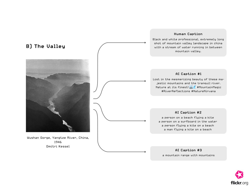
Here’s a series of experiments done by rearranging and comparing different types of captions—human-written and artificially generated—with images to observe how it alters the images generated, their different expression and, in some cases, meaning: 

Stage 2 Learnings: 

  • It was quite difficult to find a variety of caption generating software that generated different styles of captions because most platforms only generated “cheesy” social media captions, 
  • In the platforms that generated other styles of captions (not for social media), we found the depth and accuracy of the description was really limited, for example, “a mountain range with mountains.”


Stage 3. Challenges of using AI to experiment with photography?!

Since both the concept and process of using AI to regenerate  The Family of Man is experimental, we encountered several dilemmas along the way:

1. Copyright Issues with Original Photo Use 

  • It’s very difficult to obtain proper permission to use photos from the original publication of The Family of Man since the exhibition contains photos from 200+ photographers in different locations and for different publications. Hence, we’ve decided to not include the original photos of The Family of Man in the Version 3 publication.
  • This is disappointing because having the original photo alongside the generated versions would allow us to create a direct visual comparison between authentic and synthetic photographs.
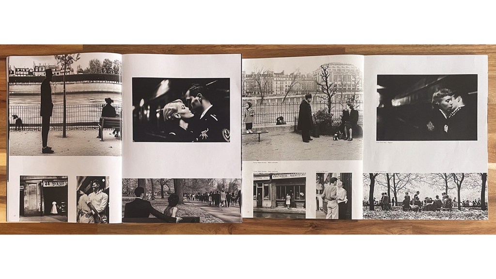
  • All original photos of The Family of Man used in this blog post were photographed using the physical catalogue in our office.

2. Caption Generation 

  • Even during the process of generating captions, we are required to plug in the original photo of The Family of Man so we’ve had to take screenshots of the online catalogue available in The Internet Archive. This can still be a violation of the copyrights policies because we’re adopting the image within our process, even if we don’t explicitly display the original image. We also have a copy of The Family of Man publication purchased by the Flickr Foundation here at the office.


4. Moving Forward..

Keeping these dilemmas in mind, we will try our best to show respect to the original photographs and photographers throughout our project. We’ll also continuously repeat this process/experimentation to the rest of the images in The Family of Man to create a new Version 3 in our A Flickr of Humanity project. 


A Flickr of Humanity: Who is The Family of Man?

Author: Maya Osaka (Design Intern) Posted July 10th 2023

Please enjoy a progress report on our R&D as we continue to develop the A Flickr of Humanity project. It’s a deep dive into the catalogue of the 1955 The Family of Man exhibition.

The Family of Man was an exhibition held at MoMA in 1955.

Organized by Edward Steichen, the acclaimed photographer, curator, and director of MoMA’s Department of Photography, the exhibition showcased 503 photographs from 68 countries. It celebrated universal aspects of the human experience, and was a declaration of solidarity following on from the Second World War. Photos from the exhibition were published as a physical catalog, and it’s largely considered a photographic classic.

Tasked with doing some research into The Family of Man I spent some time really looking at the book.

(The Family of Man 30th Anniversary Edition, 1986)

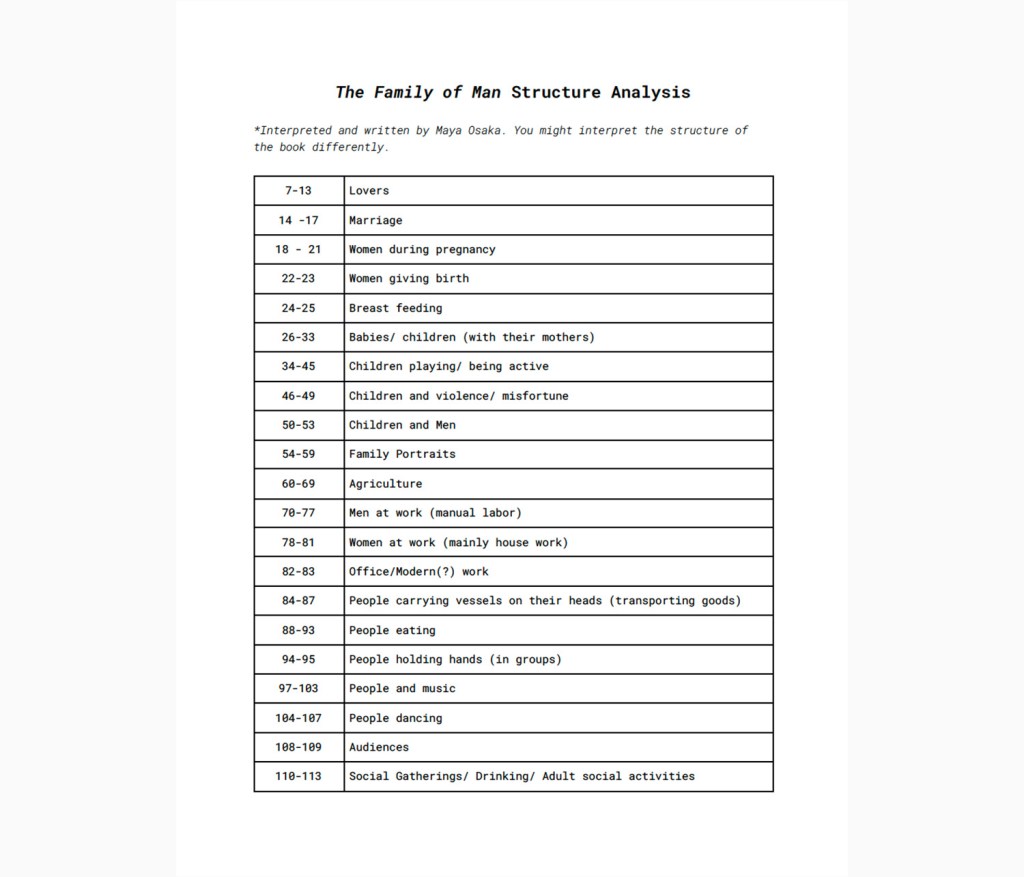
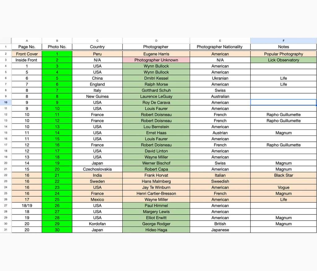
What I mean by ‘really looking at it’ is, instead of just flicking through the pages and briefly glancing at the photos I took the time to really take in each image, and to notice the narrative told through the photographs and how Steichen chose to curate the images to portray this narrative. From this experience I was able to see a clear order/narrative to the book which I listed in a spreadsheet. Each photo credits the photographer, where it was taken and which client or publication it was for (e.g. Life Magazine).

The introduction in the book explains that the exhibition was “conceived as a mirror of the universal elements and emotions in the everydayness of life—as a mirror of the essential oneness of mankind throughout the world.”

As I explored the book, I found myself wanting to answer the following questions:

  1. Where were the photographers from?
  2. Where were the photos taken?
  3. How many female photographers were involved?
  4. Who were the most featured photographers? 

In order to answer these questions I created a master index of the photographs.

This shows where they appear in the book, the country depicted, the photographer and which organization the image is associated with or was made for. From this ‘master’ spreadsheet I compiled three more views:

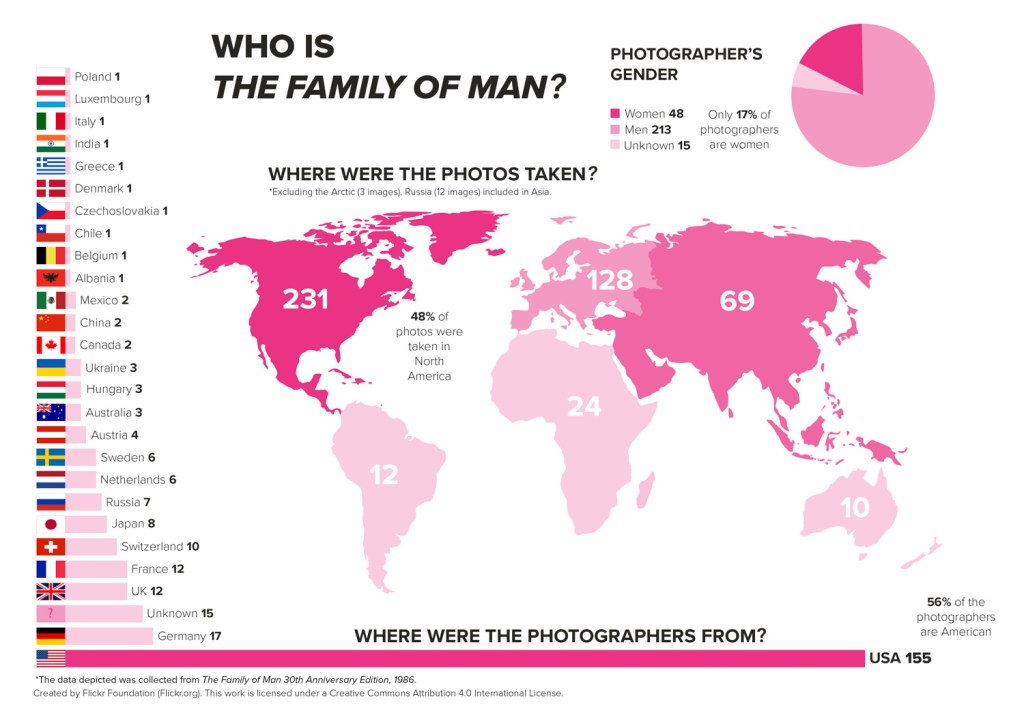
Here is what I discovered:

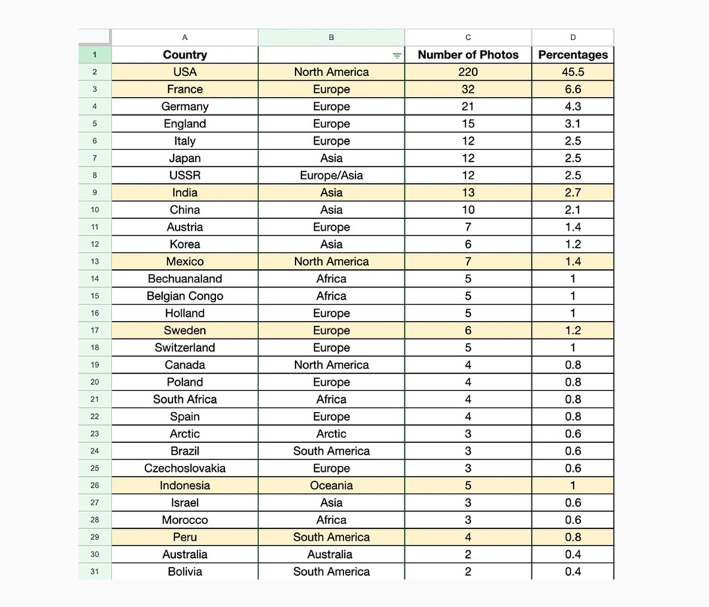
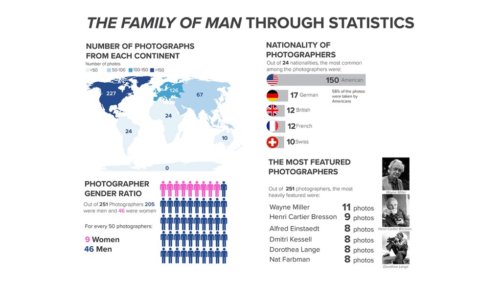
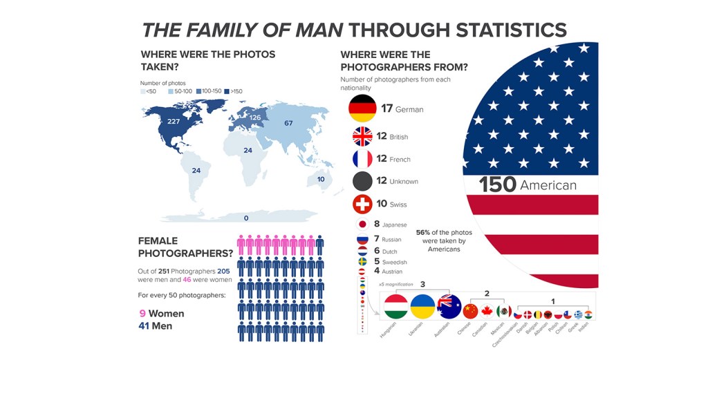
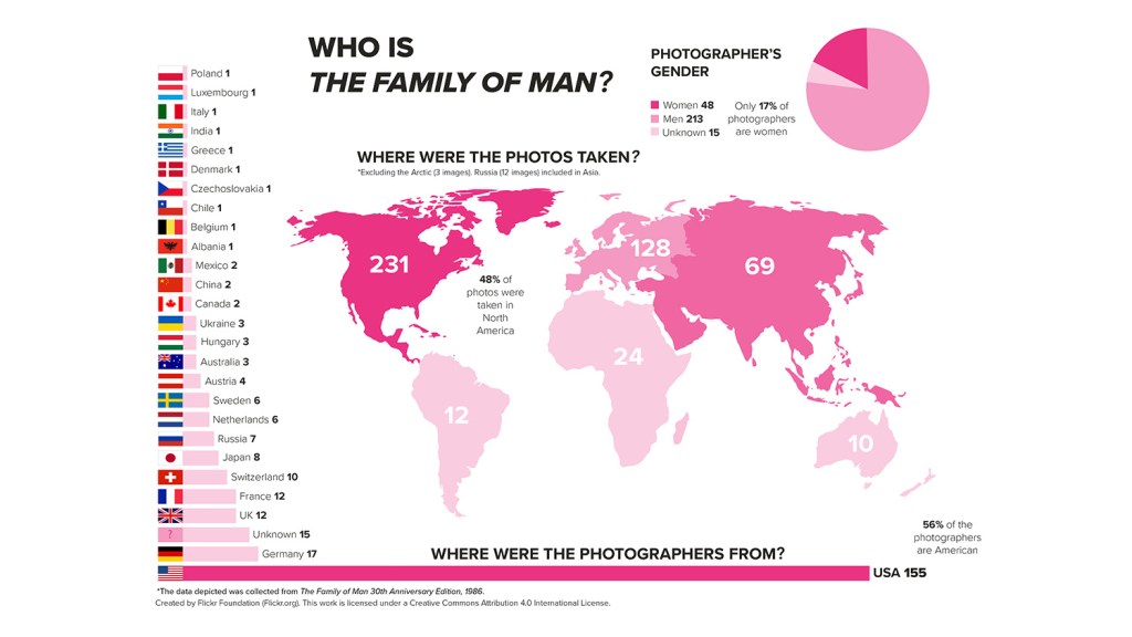
46% of the photos were taken in the USA (vs the rest of the world).

Out of 484 images depicted in The Family of Man 30th Anniversary Edition (1986), 220 are from the USA. That’s 46% of all the photos. The most heavily featured countries after America were: France (32 images), Germany (21 images) and England (15 images). All in Europe. Compared to America’s 46%, France, the runner up, makes up only 7% of the total number of images. 

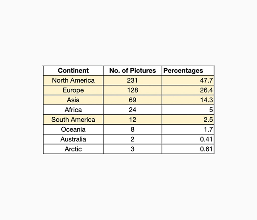
The image is a screenshot of a section of the photos by geography spreadsheet.


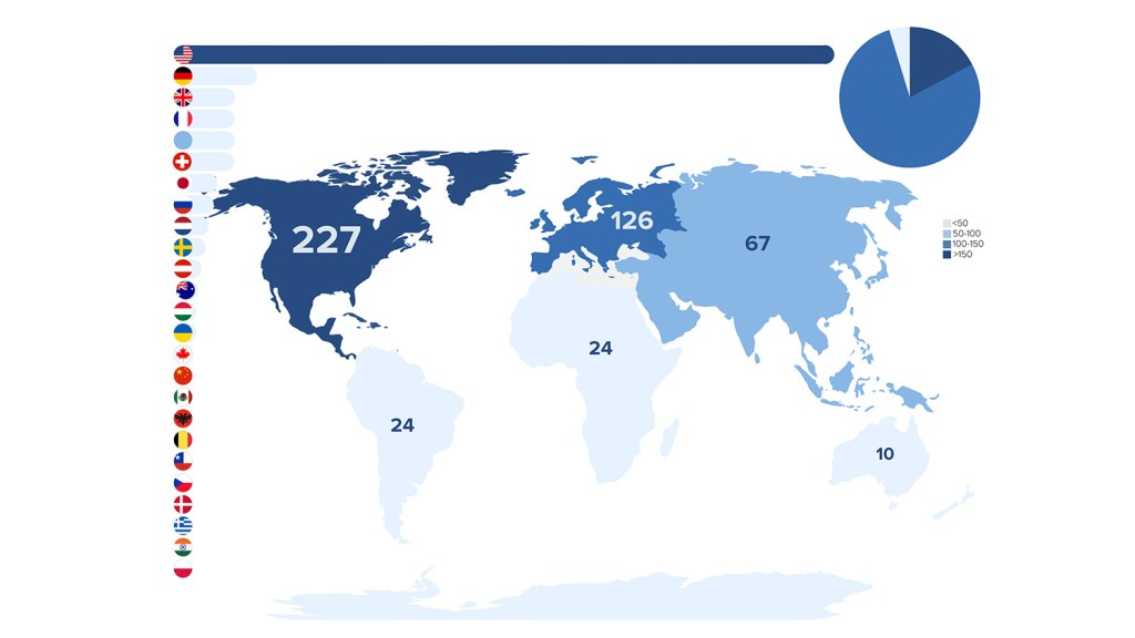
75% of the images were shot in North America or Europe. 
  • Northern America: 231 images (out of which 220 are from the USA)
  • Europe: 128 images
  • Asia: 69 images (including 12 images shot in Russia)
  • Africa: 24
  • South America: 12
  • Oceania: 8
  • Arctic: 3
  • Australia: 2

At this stage I will note that as Russia spans across Asia and Europe, Russia’s 12 images have been included within Asia’s statistics (not Europe). Also the infographic excludes 3 images taken in the Arctic as they did not explicitly state which part of the Arctic they were taken in.

The image is a screenshot of a section of the photos by geography spreadsheet.

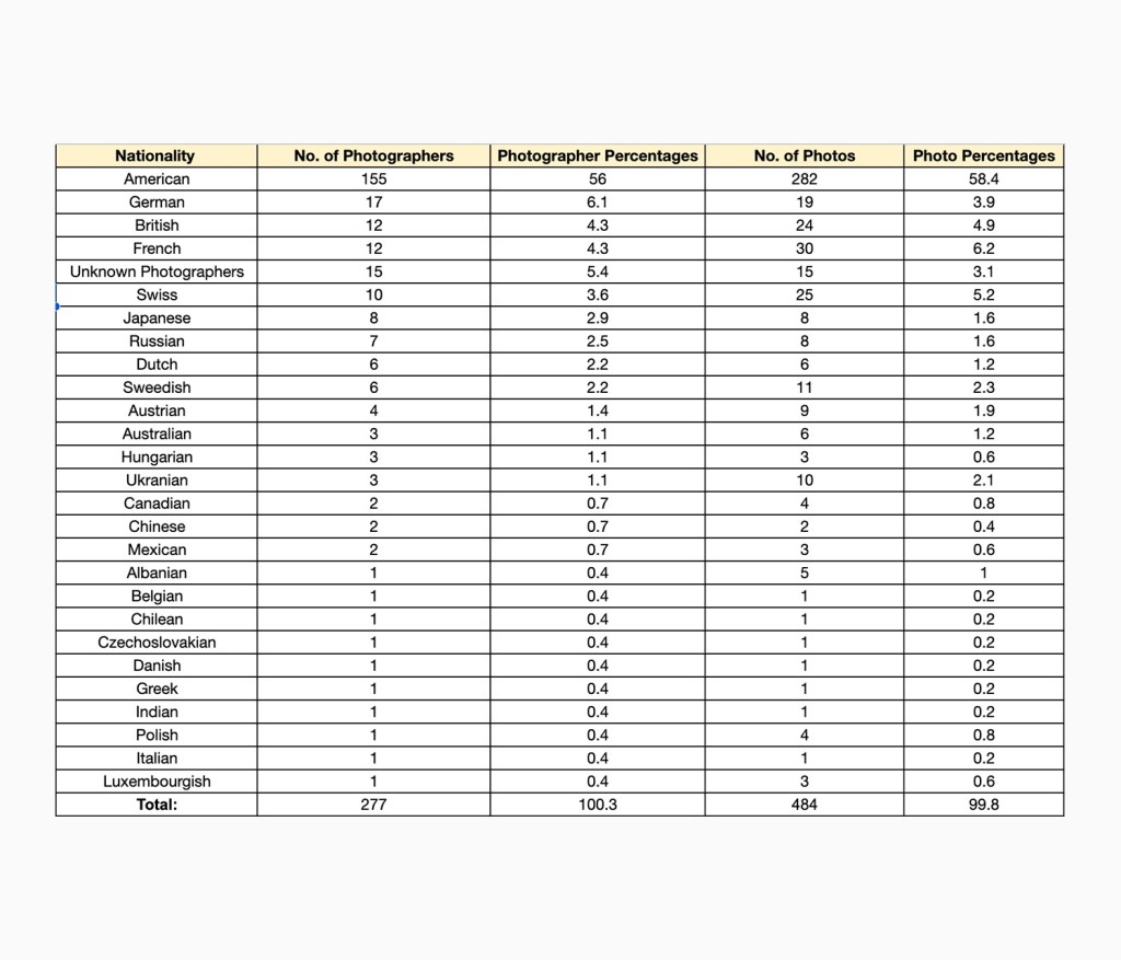
56% of the photographers were American.

Out of 251 known photographers, 155 were American. That is 56% of the total number of photographers. The most common nationalities that followed were: German (17), British and French (12 each), and 15 photographers were unknown. It is important to note that some of the photographers were multinationals and in these instances their birth nationality was counted. Information on the photographer’s nationalities were collected by searching up their name on the internet and looking for credible sources.

The image is a screenshot of a section of the photographer’s biographical data  spreadsheet. 

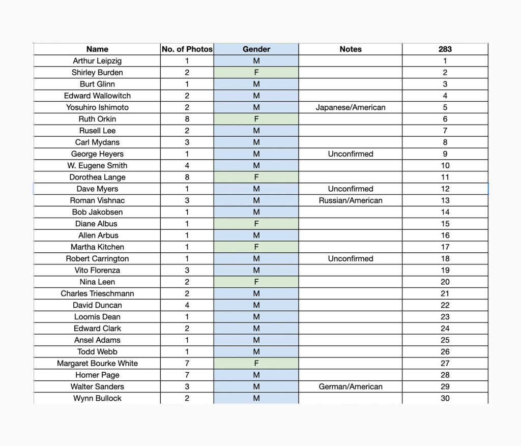
17% of the photographers were female.

Out of the 251 known photographers 48 were women. That is 17% of the total number of photographers. 

Note: There was one photograph that was credited to Diane and Allan Arbus. I counted them as two separate individuals (one male, one female).

The image is a screenshot of the photographer’s biographical data  spreadsheet. 

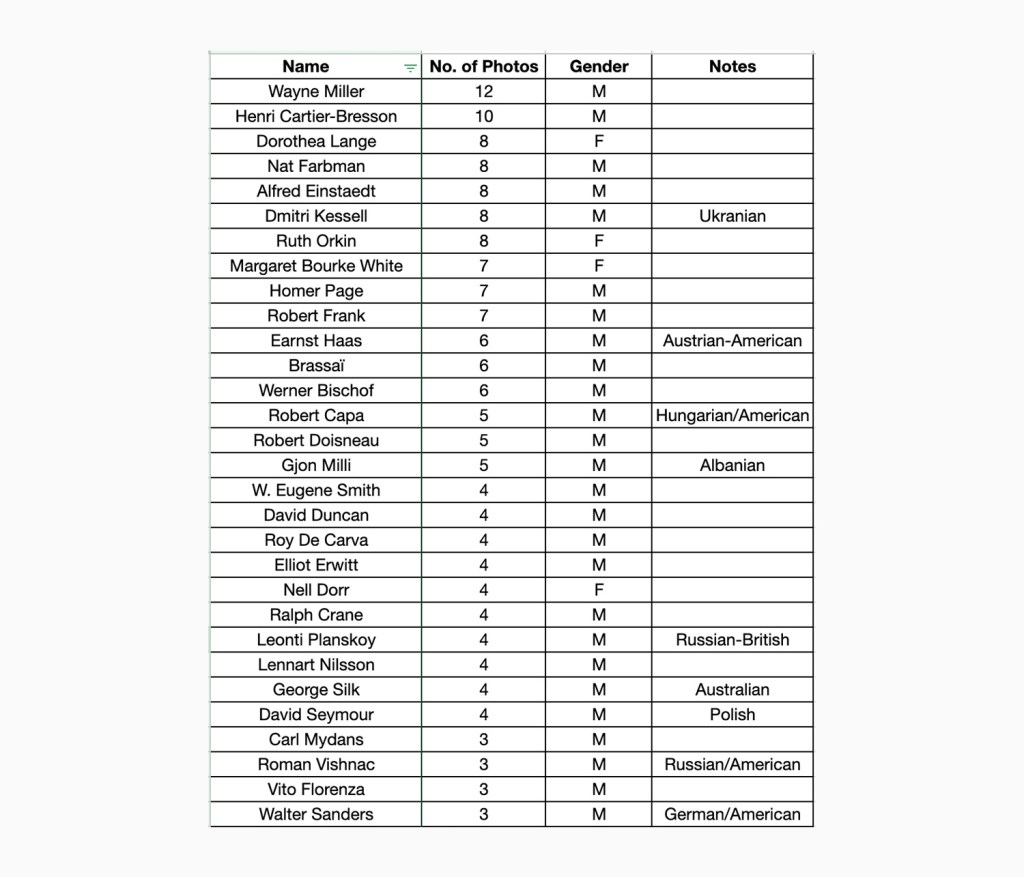
Which photographers were featured most?

  1. Wayne Miller (11 photos)
  2. Henri Cartier-Bresson (9 photos)
  3. Alfred Einstaedt (8 photos), Dmitri Kessell (8 photos), Dorothea Lange (8 photos), Nat Farbman (8 photos), Ruth Orkin (8 photos). 

The image is a screenshot of the most featured photographers spreadsheet. 

Conclusions

  1. The majority of photos were shot in the US and Europe. 
  2. More than half of the photographers were American.
  3. Most of the photographers were men.
  4. Among the top 10 most featured photographers were three women (Dorothea Lange, Ruth Orkin and Margaret Bourke White).

Where are the lost photos?

On the back of The Family of Man (30th Anniversary Edition, 1986) it is stated that all 503 images from the original exhibition are showcased within the book. However, after checking through the book multiple times the number of images that I have counted (excluding the introduction images featuring images of the exhibition itself and a portrait of Steichen) are 484. This means there are 19 images that are missing.

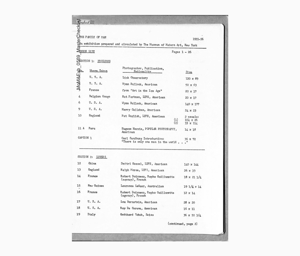
This mystery is currently being solved by my fellow intern, Juwon Jung, who, as I write this, is cross referencing the original MoMa exhibition master checklist with the book. We will keep you posted on whether this mystery gets solved!

Creating the Infographics

While collecting this data, I began to think about how this data could be visualized. Datasets on a spreadsheet are boring to look at and can struggle to effectively communicate what they mean. So I decided to create an infographic to showcase the datasets. 

Creating the infographics posed many creative challenges, especially because this was one of my first attempts at this sort of data visualization. One of the key challenges was to create visuals that are eye-catching but simple to read and communicate a clear message. In this case: that a disproportionately large amount of the photos and photographers are of or from the USA and the majority of photographers were men.

In order to draw attention to those facts, I used a combination of techniques: Firstly the statistics that I wanted to draw the most attention to are the brightest shade of pink. (The pink that was chosen is the same pink as the Flickr Foundation logo). Secondly, the pie chart and bar chart’s proportions are accurate and highlight just how disproportionate the statistics are. A comment next to each chart states a percentage that further highlights the point that is being made. 

George Oates (Executive Director at Flickr.org)—who has extensive experience working in data visualisation—helped a lot with perfecting the look of the infographic. (Thanks George!)

Below you can see how the graphics evolved.
*Note that the statistics on previous versions are not accurate!