Blog

"The common theme was that belief that the web was about giving people power and a voice to hold the powerful accountable. It really did happen! We didn’t imagine it! And it got fully subverted."
On recommendations for improved digital legacy features for Flickr members.
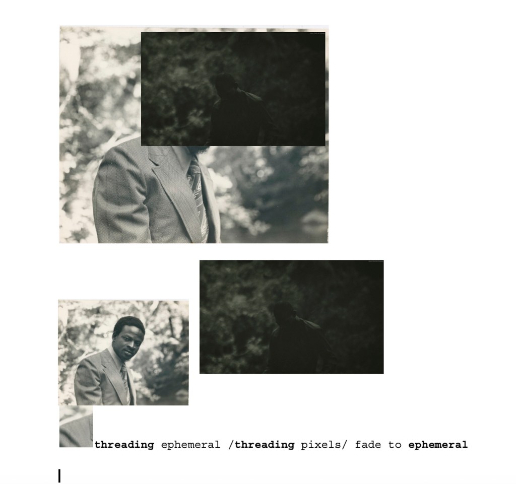
As Oreoluwa's Fellowship project draws to a close, they share their concluding artistic output and critical reflections on image-making
Read our market research on how social media platforms allow their users to download their stuff.
We're making adjustments to our programming and team in the coming months to weather the current storm affecting nonprofits across the US and more broadly.
Here's a handy compendium of all the stuff we've done this year. Wheee!
Flickr Foundation's Winter Research Fellow shares their reflections on the Fellowship so far and the next phases of their creative, archival research
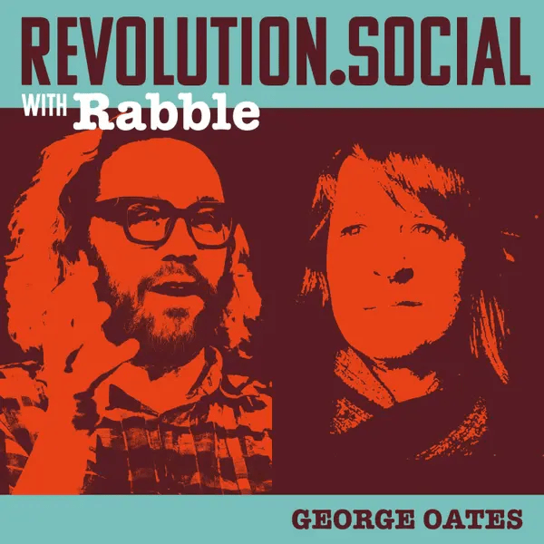
George talks with Rabble of Revolution Social to discuss her work designing Flickr and the model for an alternative internet with care, community and preservation at its core.
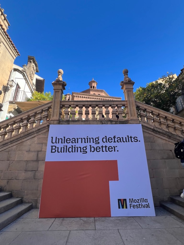
Tori and George headed to Barcelona to talk digital legacy in the age of social media and what should be done about it
Please welcome the Eötvös Loránd University Faculty of Law Library to Flickr Commons! Our first Hungarian member.
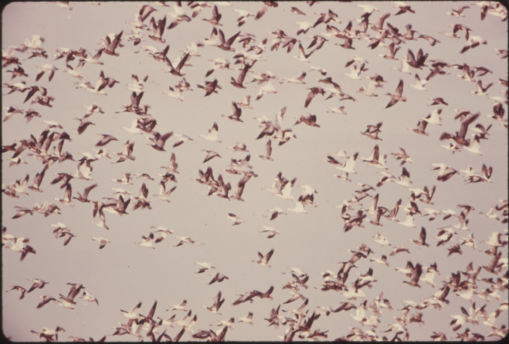
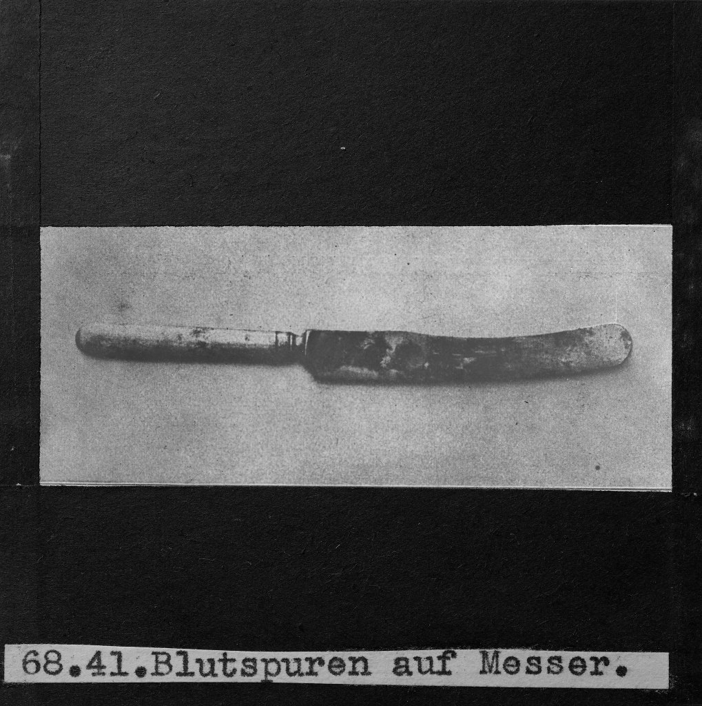
"Entire categories of imagery or creators can disappear simply because no one thought they mattered in the moment. That’s the tension between saving and hoarding."
Digital libraries and cultural heritage leader, Rachel L. Frick, joins our Board of Directors.
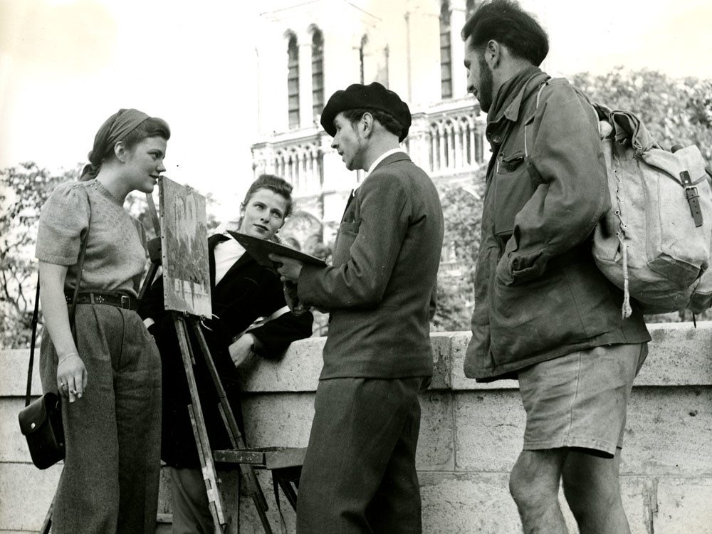
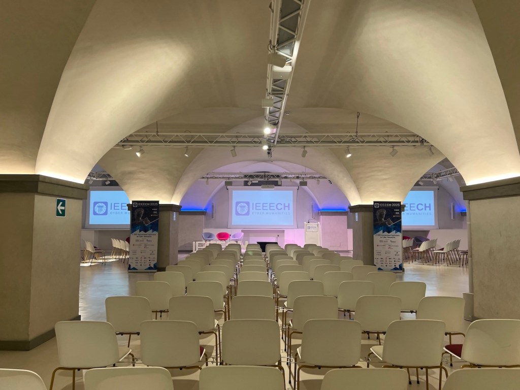
Our second stop on the European conference circuit was Paris, for the Sixteenth International Conference on The Image where George and Tori shared the release of Data Lifeboat and the importance of citizen-driven collecting.
Tori shares her reflections on a recent conference in Florence, where she detailed our progress on the Data Lifeboat alpha alongside the value of collecting from social media for heritage practitioners.
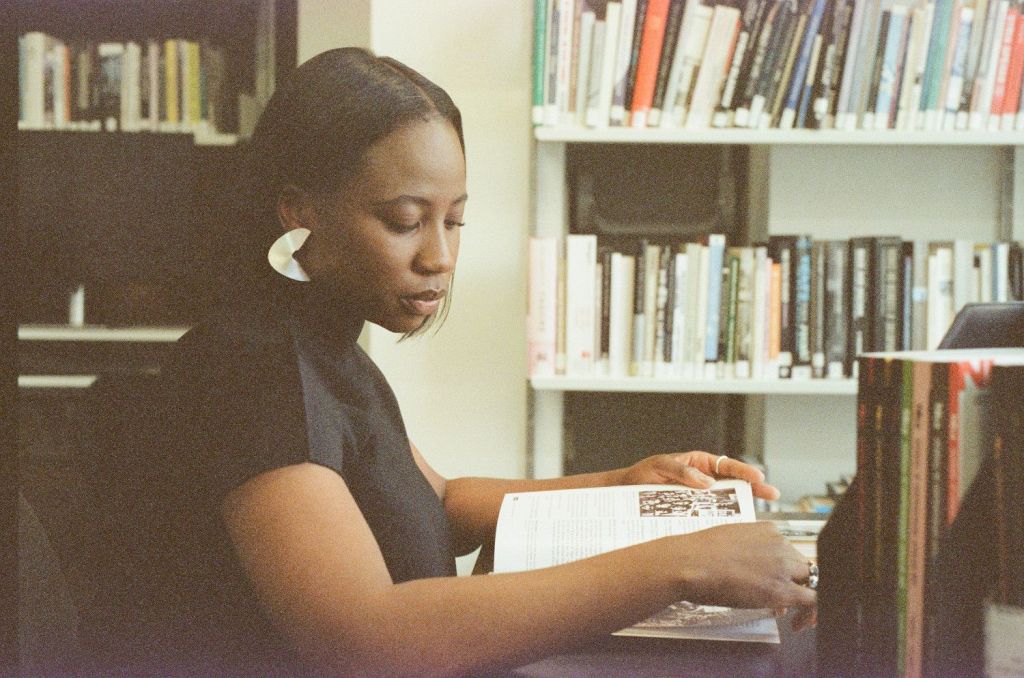
Meet Tosin Adeosun as she details her experiences as a digital curator, managing care and loss in user-generated archives and shares some of her favorites from the Flickr Commons collection.
| Cookie | Duration | Description |
|---|---|---|
| cookielawinfo-checkbox-analytics | 11 months | This cookie is set by GDPR Cookie Consent plugin. The cookie is used to store the user consent for the cookies in the category "Analytics". |
| cookielawinfo-checkbox-functional | 11 months | The cookie is set by GDPR cookie consent to record the user consent for the cookies in the category "Functional". |
| cookielawinfo-checkbox-necessary | 11 months | This cookie is set by GDPR Cookie Consent plugin. The cookies is used to store the user consent for the cookies in the category "Necessary". |
| cookielawinfo-checkbox-others | 11 months | This cookie is set by GDPR Cookie Consent plugin. The cookie is used to store the user consent for the cookies in the category "Other. |
| cookielawinfo-checkbox-performance | 11 months | This cookie is set by GDPR Cookie Consent plugin. The cookie is used to store the user consent for the cookies in the category "Performance". |
| viewed_cookie_policy | 11 months | The cookie is set by the GDPR Cookie Consent plugin and is used to store whether or not user has consented to the use of cookies. It does not store any personal data. |