Blog


Tori shares her highlights from Flickr Foundation's big week in the Netherlands talking data care and digital commons
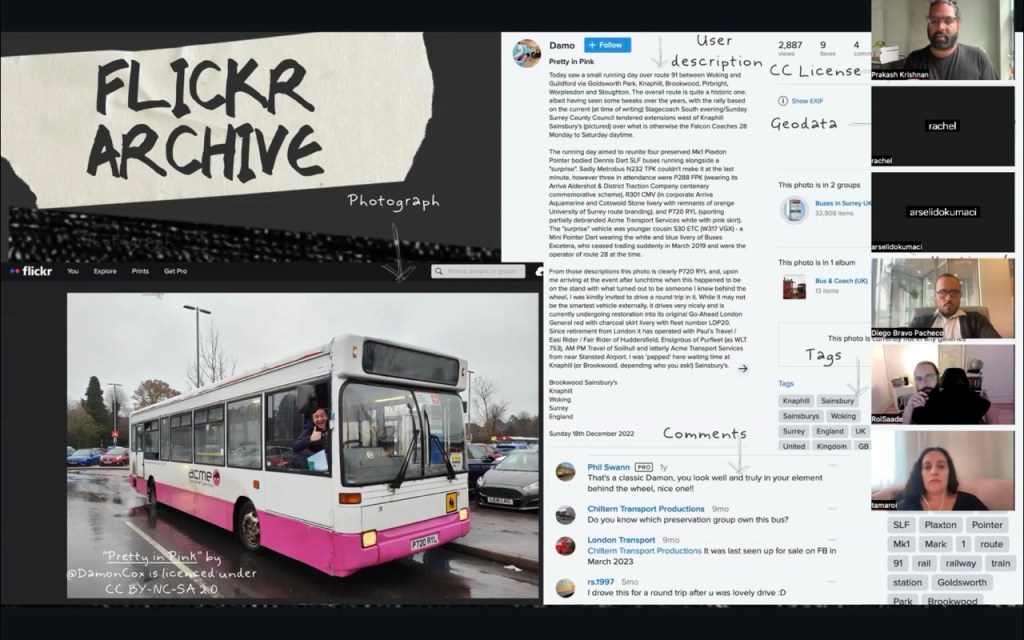
"As the home of the largest collection of Creative Commons-licensed photos on the planet, Flickr has long championed the power of CC licensing..."
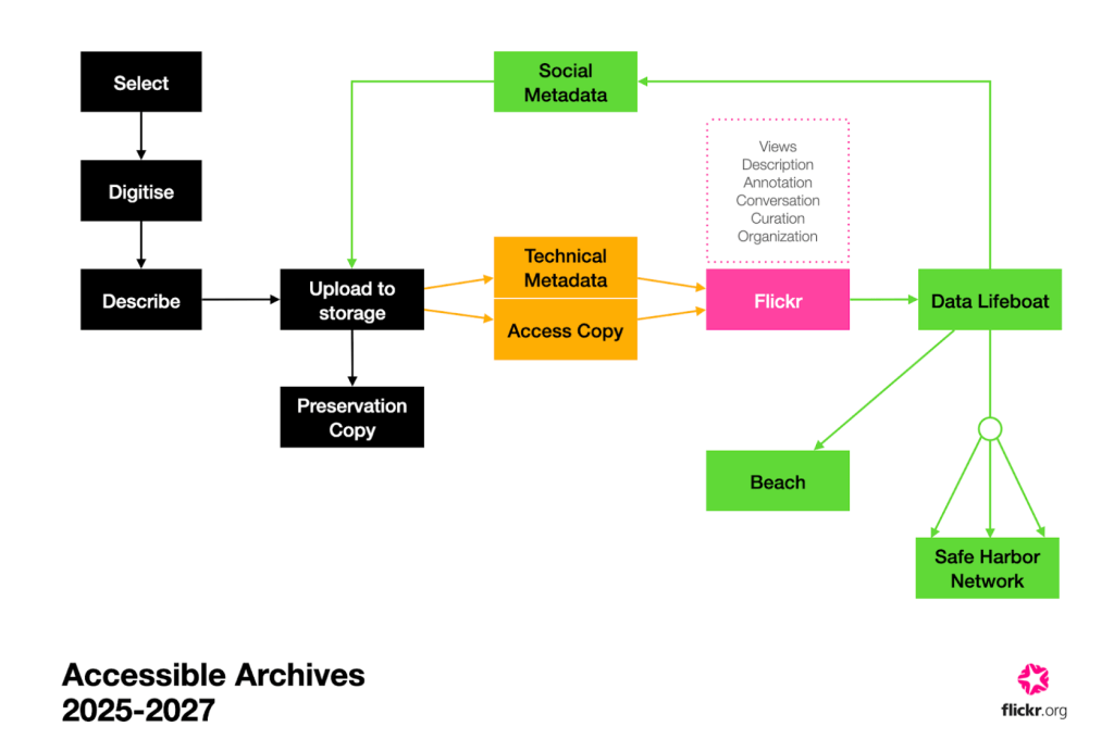
Please enjoy our write-up of the co-design workshops we ran last year with preservation experts, archivists, librarians, academics, and technologists on the viability of Data Lifeboat
Find out more about how we are centering our work on the digital image lifecycle, from creation to preservation
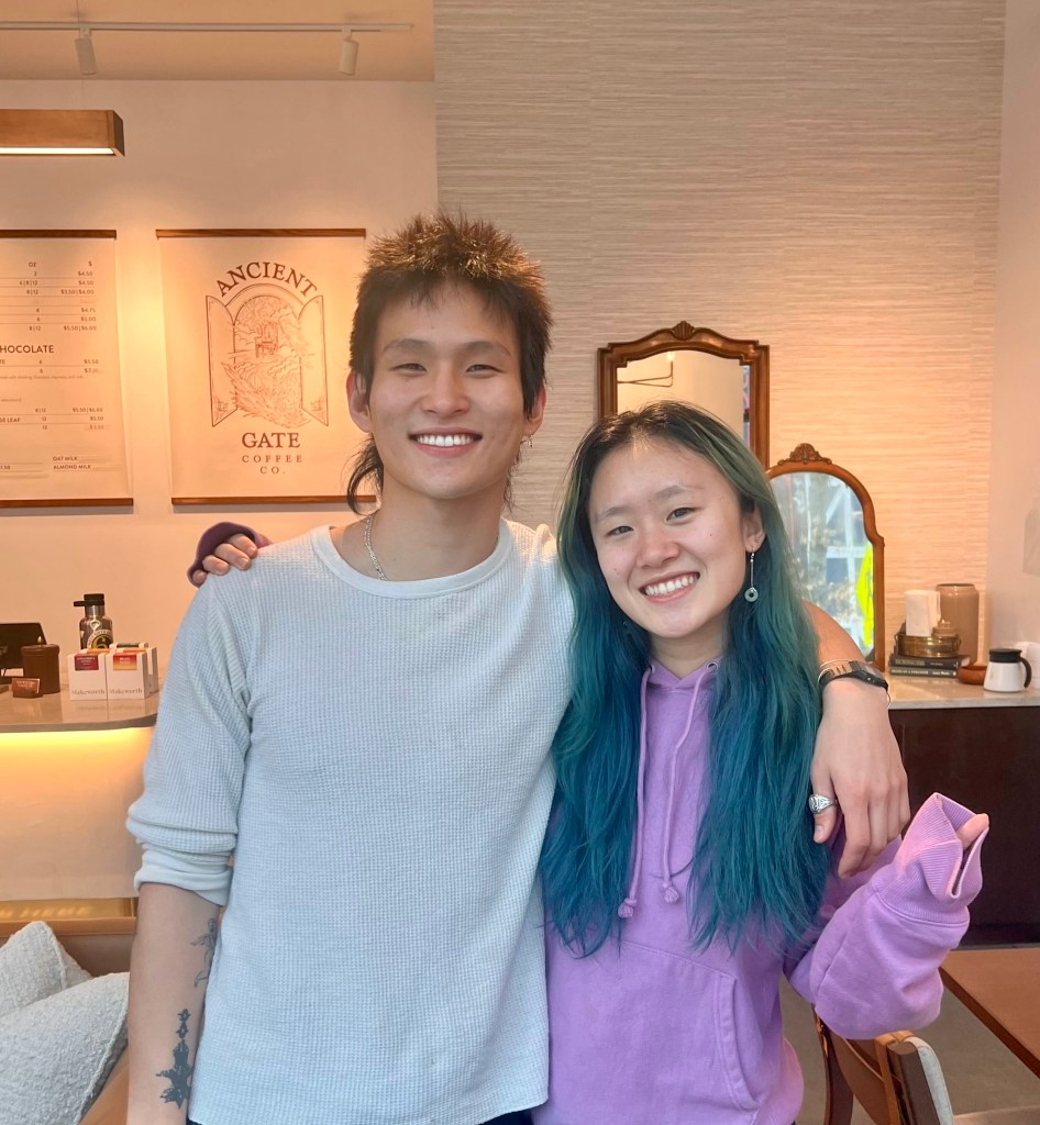
Tori shares her reflections from the Rijksmuseum x World Press Photo Forum symposium in May
Digital media theorist, Jill Blackmore Evans, sets up the argument against 'restorative nostalgia' and towards a more enlivened mode of web archiving
Flickr Foundation Spring Research Fellows, Molly Sherman & Emily Fitzgerald, share the second instalment of their research project, investigating image archives of reproductive care on Flickr.
Final instalment of Amy & Daniel's Digital Legacy capstone project, this time exploring the topic through in-person workshops
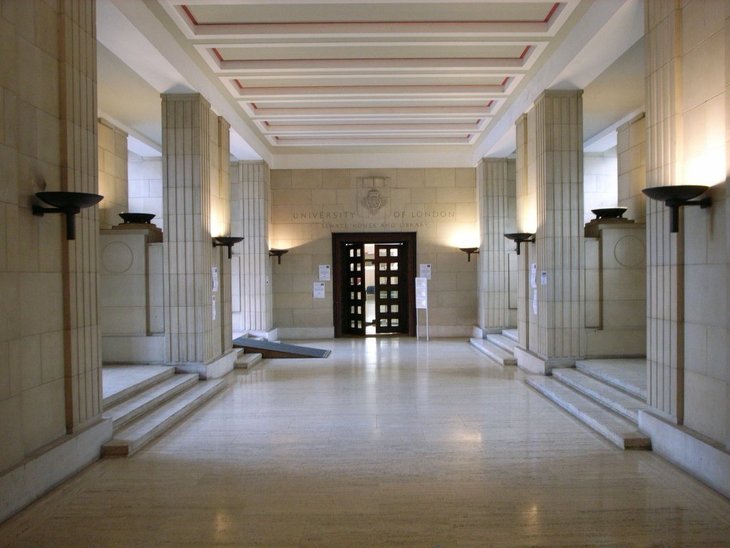
Tori shares her reflections and ruminations from the Born-Digital Collections conference at Senate House, London
In the second instalment, Amy and Daniel discuss the expert interviews and user research they undertook to uncover insights into Gen Z's digital archival literacy
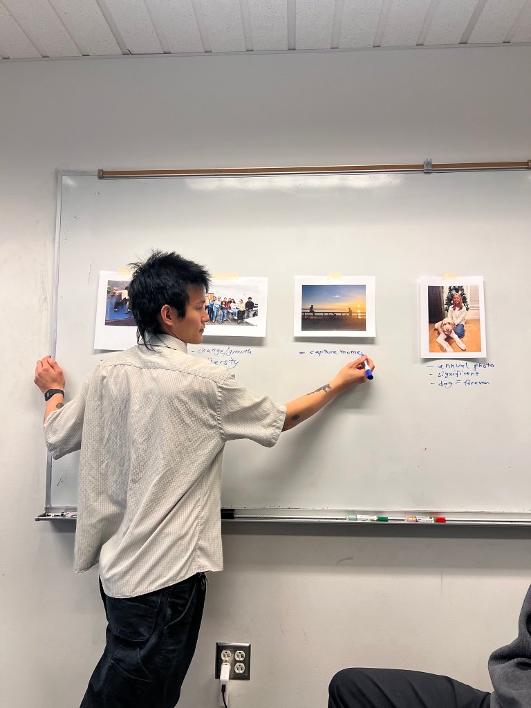
Meet the researchers Prakash ran his first Archivevoice workshop with, and their fantastic projects.
University of Washington Informatics students, Amy and Daniel, introduce their capstone research into digital legacy practices among young adults
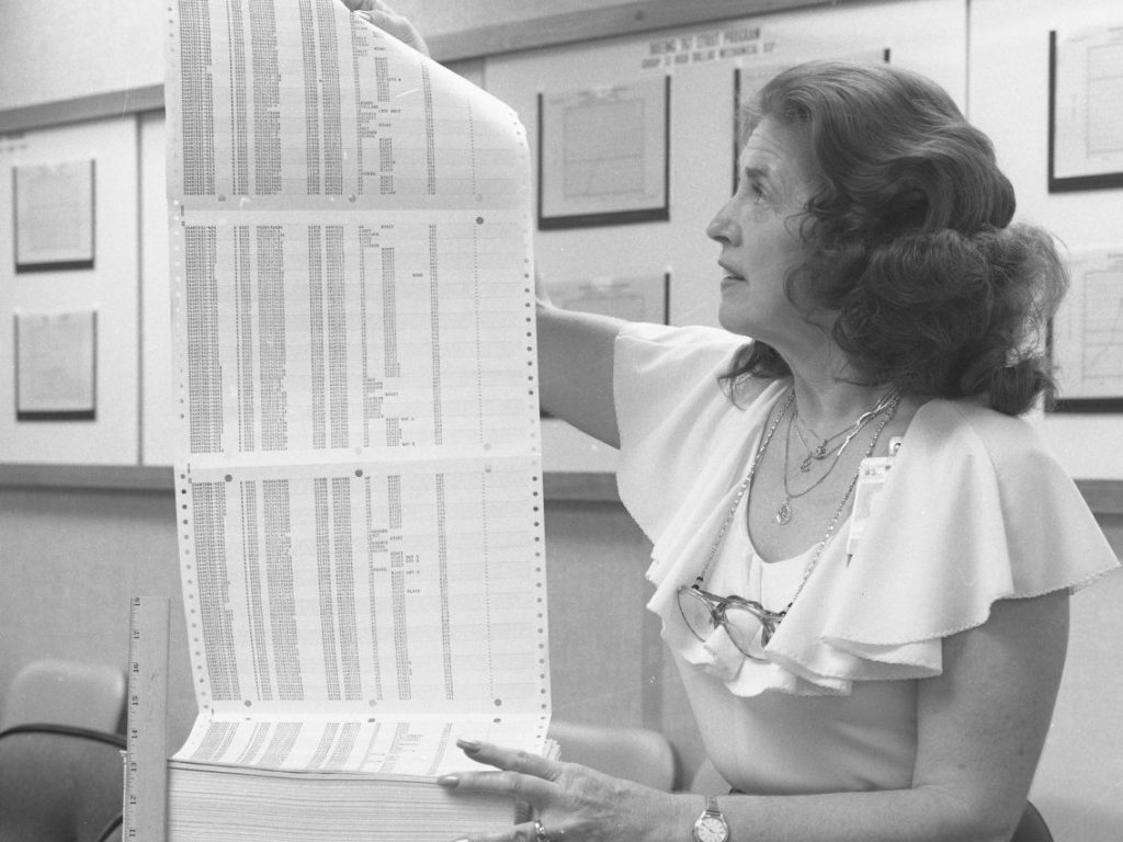
An introduction to the rituals of record-keeping that have influenced our daybook project
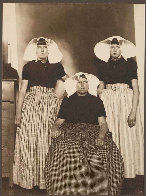
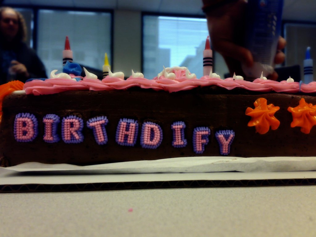
Our flagship program, Flickr Commons, turns 17 years old today!
| Cookie | Duration | Description |
|---|---|---|
| cookielawinfo-checkbox-analytics | 11 months | This cookie is set by GDPR Cookie Consent plugin. The cookie is used to store the user consent for the cookies in the category "Analytics". |
| cookielawinfo-checkbox-functional | 11 months | The cookie is set by GDPR cookie consent to record the user consent for the cookies in the category "Functional". |
| cookielawinfo-checkbox-necessary | 11 months | This cookie is set by GDPR Cookie Consent plugin. The cookies is used to store the user consent for the cookies in the category "Necessary". |
| cookielawinfo-checkbox-others | 11 months | This cookie is set by GDPR Cookie Consent plugin. The cookie is used to store the user consent for the cookies in the category "Other. |
| cookielawinfo-checkbox-performance | 11 months | This cookie is set by GDPR Cookie Consent plugin. The cookie is used to store the user consent for the cookies in the category "Performance". |
| viewed_cookie_policy | 11 months | The cookie is set by the GDPR Cookie Consent plugin and is used to store whether or not user has consented to the use of cookies. It does not store any personal data. |